

Building a web application and producing a smooth user experience in the always changing world of web development requires more than just good looks – you also need to make sure that your application's design is efficient and consistent throughout.
If you have a design system in place, you can easily build UI components that are consistent and can be reused across numerous projects while still looking nice.
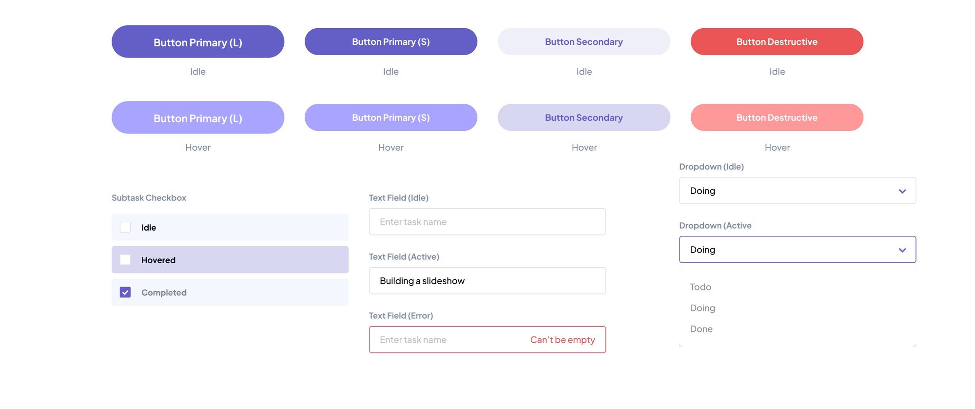
A design system is a set of reusable UI components and design tokens. These tokens are like building blocks that include things like buttons, colors, and fonts. Its goal is to enable developers and designers to create engaging product experiences by providing consistent user experience across all products.
Designers often use tools like Figma to create these systems. Here's an example of a design system made in Figma:
After designers make these parts, developers can use different tools to actually use them and build the website. There are various frameworks that frontend engineers can choose from to do this. Some popular ones are MaterialUI and ChakraUI. These libraries can make things easier, but they might not cover all the special cases you want.
If you or your design team have specific designs in mind that don't match what existing libraries offer, you'll need to dive into writing a substantial amount of code. However, this process can quickly become tiresome and burdensome, especially when the code you're creating lacks consistency or when you find yourself repeatedly constructing the same UI elements.
This is where a design system becomes incredibly valuable. Armed with the knowledge of how to implement a design system, you gain the ability to craft a tailored design that seamlessly integrates with the existing design system, offering the level of flexibility you desire.
Furthermore, this approach offers the advantage of only having to construct only the components you truly need. Unlike using libraries, which often come with numerous pre-built components you might never use, this method keeps your codebase focused and efficient.
Creating your own design might sound appealing, but it's not as straightforward as it might appear.
Nonetheless, with the assistance of styling tools such as Tailwind CSS (which is ideal due to its high level of customization), a library known as cva (which is short for class-variance-authority), and along with TypeScript, the process of establishing your custom design system within Next.js becomes notably achievable.
Now that you have a clear understanding of what a design system is and its significance, continue reading to discover how these tools can be effectively combined to achieve our objectives.
Project Setup: Installation Of The CVA Library
For the purpose of this article, it is assumed that you have already set up your Next.js project and incorporated TypeScript and Tailwind CSS.
If not, integrating these two elements into a new Next.js project is a straightforward process.
Following this initial setup, you can effortlessly add the CVA library to your project using the following command:
npm i class-variance-authority
With the inclusion of CVA, a user-friendly interface is at your disposal, simplifying the definition of variants.
These variants enable the conditional application of class sets, while also offering the means to express default variations. If this sounds a bit complex at the moment, don't worry – we'll delve into practical examples as we move forward.
Practical Example: Implementing a Custom Design System
Imagine a situation where you're constructing a CRUD application, equipped with buttons to carry out various actions such as create, read, update, and delete.
While these buttons might share common attributes like font-size and border-radius, they might differ slightly – for instance, in their colors. Perhaps you'd prefer a red button for the delete action, a blue one for create, and a black one for update.
Traditionally, you might consider creating separate components for each button and assigning them distinct colors. For instance, to make the black button, you'd include the Tailwind CSS utility class bg-black to set the background color:
export default function Button() {
  return (
    <button
      className="bg-black rounded-3xl py-2 text-white w-80 font-sm"
      // other button attributes
    >
      //button text
    </button>
  );
}
However, instead of creating separate components for each button, you can streamline the process by designing a single button component that can adapt to the various button variants you need. This concept is the heart of a design system.
Let's explore how we can transform this same button component we previously created to suit our needs.
Our first step is to import the cva function and the VariantProps from the class-variance-authority library. As we proceed, the significance of these imports will become apparent:
import { cva, VariantProps } from 'class-variance-authority'
Subsequently, we will define a variable named buttonStyles. This variable will house the invocation of the cva function.
Within this function, we'll first provide the default styles for the buttons, followed by the variants object. This object will contain the variations for the different types of buttons we desire. This segment is pivotal when implementing the design system.
In your code, include the following code snippet:
const buttonStyles = cva("rounded-3xl py-2 text-white w-80 font-sm", {
  variants: {
    intent: {
      primary: "bg-blue-700",
      secondary: "bg-black",
      danger: "bg-red-600",
    },
    defaultVariants: {
      intent: "primary",
    },
  },
});
Within the embedded variants object, there exists another object named intent. This is where you assign names to the distinct button variations you desire – for instance, primary, secondary, and danger, corresponding to the create, update, and delete buttons respectively.
The style defined for the intent specified when rendering the button will be applied to that button, wherever it appears.
Additionally, the variants object features another property called defaultVariants. The intent within the defaultVariant object will be applied when no explicit intent is provided. In this instance, we have set the default intent to primary.
Next, we'll define an interface named ButtonProps which extends the VariantProps type provided by the class-variance-authority library:
interface ButtonProps extends VariantProps<typeof buttonStyles> {
  text: string;
}
This interface is used to define the props that the Button component will accept. The VariantProps type from class-variance-authority adds the intent property, which will be used to determine the variant of the button. The interface also includes an additional property called text, which is of type string, it is the actual text that will appear on the button.
Having done this, we can go ahead and implement the Button component with respect to this defined interface:
export default function Button({ intent, text, ...props }: ButtonProps) {
  return (
    <button className={buttonStyles({ intent })} {...props}>
      {text}
    </button>
  );
}
In the Button component function, we used object destructuring to receive the intent property from the ButtonProps passed to the component.
Additionally, we used the spread operator (...props) to spread any other props that might be passed to the component. This allows us to easily pass down any other attributes or event handlers to the <button> element.
This also makes our props accurately typed, with their types precisely aligned as you hover over each one. For instance, the intent prop strictly adheres to the intents we defined within the buttonStyles variable, ensuring a robust type correspondence:
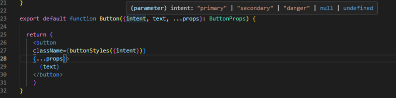
Moving on, the crucial part is the className attribute on the <button> element. We're using the buttonStyles function to pass in an object with the intent property, which corresponds to the desired button variant (primary, secondary, or danger).
This dynamically generates the appropriate styles based on the selected intent, applying the associated styles to the button.
At last, we've streamlined the process of creating buttons with different styles, allowing us to utilize a single Button component while dynamically altering its appearance through the intent prop, showcasing the effective implementation of our personalized design system.
With this in place, you're now equipped to render the Button component according to your needs and preferences. As a visual demonstration, let's observe the outcomes after rendering each of the variants:
<>
  <Button intent="primary" text="Create" /> <br /> <br />
  <Button intent="secondary" text="Update" /> <br /> <br />
  <Button intent="danger" text="Delete" /> <br /> <br />
</>
Visual result:
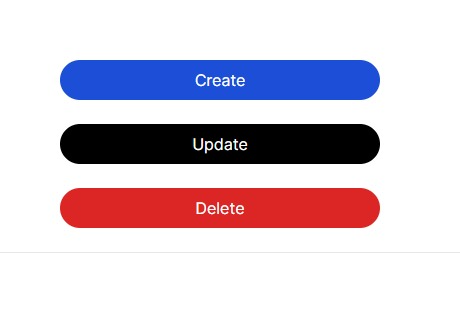
This visual representation underscores the versatility and adaptability of our streamlined Button component, showcasing the distinct styling achieved through the intent-based approach within our own crafted design system.
Wrapping Up
Throughout this journey, you've gained insights into the potential of a design system to produce a versatile button component that dynamically changes colors in response to the provided intent.
It's important to note that this adaptability isn't confined solely to colors – you can similarly experiment with font sizes, text colors, and various other CSS properties.
Empowered by the insights you've gathered, you're now positioned to leverage this newfound knowledge to not only enhance your understanding of design systems but to also implement creative solutions that align with your unique project requirements. Happy Coding!