

Dropdowns have been an important part of websites and apps for a long time. They're an unsung heros of user interactions, silently facilitating countless actions and decisions with just a click or tap.
You probably encountered one today, whether it was selecting a category on your favourite online store or choosing your birthdate on a registration form.
But what if I told you that there's a secret ingredient that can elevate your dropdowns from mundane to magnificent?
Join me as I dissect the mysteries of the compound component pattern and harness its abilities to build a dynamic dropdown component.
Prerequisites
- Fundamentals of HTML, CSS and Tailwind CSS
- Fundamentals of React and React Hooks.
What We'll Cover:
- Understanding Dropdown Components
- Understanding Compound Components
- How to Build the Dropdown Component
– Regular Functional React Method
– The Compound Component Pattern Method - Comparison between the Regular and the Compound Component Method
- Conclusion
Understanding Dropdown Components
Dropdown components play a pivotal role in user interface design, functioning as interactive menus that empower users to make selections from a list of options. Typically, they comprise of a clickable area that, upon activation, unveils a roster of choices for the user to make a selection from.
The operation of a dropdown component is straightforward: when a user engages with it—often through clicking or tapping—the dropdown expands, showing the available options.
Subsequently, the user can opt for one of these choices, which is then either shown within the dropdown itself or utilized to update a related field or element in the interface.
Dropdown components provide a clean and efficient method to present a variety of choices to users, rendering them well-suited for scenarios where multiple options need to be accessible while maintaining a tidy interface.
Dropdowns also serve purposes such as:
- Navigation Aid: Acting as navigational aids, dropdowns help users move through websites by providing menus to jump to different sections or pages.
- Form Inputs: Simplifying data entry, dropdowns present users with predefined options for selection, such as choosing a country, date of birth, or preferred language during account registration.
- Filters: In e-commerce platforms, dropdowns enable shoppers to refine their search results by selecting options like product categories, price ranges, or brands.
- Menu Selectors: Commonly used on restaurant websites, dropdowns display menus or allow users to choose a cuisine type, facilitating easy exploration and selection of dining options.
- Data Presentation: Dropdowns can organize and present data effectively, allowing users to filter information by criteria such as date range, geographic region, or product category in dashboards or analytics tools.
An example of dropdown components can be seen here:
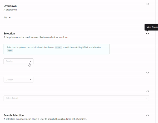 Showing Dropdown Demo
Or on Semantic UI’s page.
Understanding Compound Components
The compound component pattern is like building with LEGO blocks: you assemble smaller pieces to create something bigger and more complex. In React, it's a clever way of designing components from several smaller parts that work together seamlessly.
Imagine that you're building a dropdown menu. Instead of creating one monolithic component that handles everything, you break it down into smaller, reusable pieces. You might have one component for the dropdown button, another for the list of options, and yet another for handling the state and interaction logic.
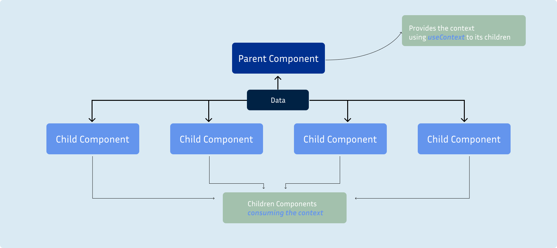 Compound Component Illustration
Here's where it gets interesting: these smaller components communicate through a shared context. Context is like a messenger that carries information from one component to another without needing to pass it down through every level of the component tree.
It's a powerful tool that simplifies the process of sharing data between components, especially when they're deeply nested.
Now, why is this pattern so beneficial?
- First off, it improves readability. By breaking down a complex component into smaller, more focused pieces, the code becomes easier to understand and maintain. Each component has a clear responsibility, making it easier to debug and update.
- Secondly, compound components enhance maintainability. Since each piece of the component handles a specific task, making changes or adding new features becomes much simpler. You can modify one part of the component without affecting the others, reducing the risk of introducing bugs.
- Finally, compound components provide great flexibility. You can combine different parts to make special versions of the component without having to rewrite any code. This makes it easier to adjust the component for different purposes and design requirements.
So, while the idea of using context to build UI components may seem unusual at first, it's a clever way of creating dynamic and reusable components that empower developers to build exceptional user experiences.
In the next section, we'll dive deeper into how context is used to bring compound components to life.
How to Build the Dropdown Component
I've prepared a GitHub repository with starter files to speed things up. Simply clone this repo and install the dependencies.
In this section, we'll build a dropdown component using regular functional React, then compare it with the CC pattern to grasp the difference fully. PS: you'd like the compound component pattern. 😁
 Oh Fo sho Snoop Dogg gif
Regular Functional React Method
We'll start by creating the basic structure of our dropdown component. This will involve setting up the main dropdown container, the button to trigger the dropdown, and the list of options.
const Dropdown = () => {
  return (
    <div>
      <label className="mt-4">Assign user(s) to as task:</label>

      <button className="  px-4 w-full py-2 flex items-center justify-between  rounded border border-[#828FA340] hover:border-primary cursor-pointer relative ">
        <span className="block">
          <FiChevronDown color="#635FC7" size={24} />
        </span>
      </button>
    </div>
  );
};
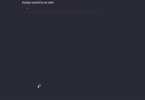
Which gives:
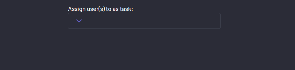 Dropdown button rendered
Then pass in the users array into the dropdown to create a list of users.
const Dropdown = ({ usersArray }) => {
  return (
    <div>
      <label className="mt-4">Assign user(s) to as task:</label>

      <button className="  px-4 w-full py-2 flex items-center justify-between  rounded border border-[#828FA340] hover:border-primary cursor-pointer relative ">
        <span className="block">
          <FiChevronDown color="#635FC7" size={24} />
        </span>
        {
          <div className="absolute bottom-full translate-x-9  left-full translate-y-full rounded bg-[#20212c] w-max">
            <ul className="flex flex-col p-2">
              {usersArray.map((user) => (
                <li
                  key={user.id}
                  className={`flex items-center gap-2 p-4 hover:bg-[#2b2c37] rounded transition-all duration-200 `}>
                  <img
                    className="w-6 h-6 "
                    src={user.imgUrl}
                    alt={`${user.name} image`}
                  />
                  <span>{user.name}</span>
                </li>
              ))}
            </ul>
          </div>
        }
      </button>
    </div>
  );
};
Which gives:
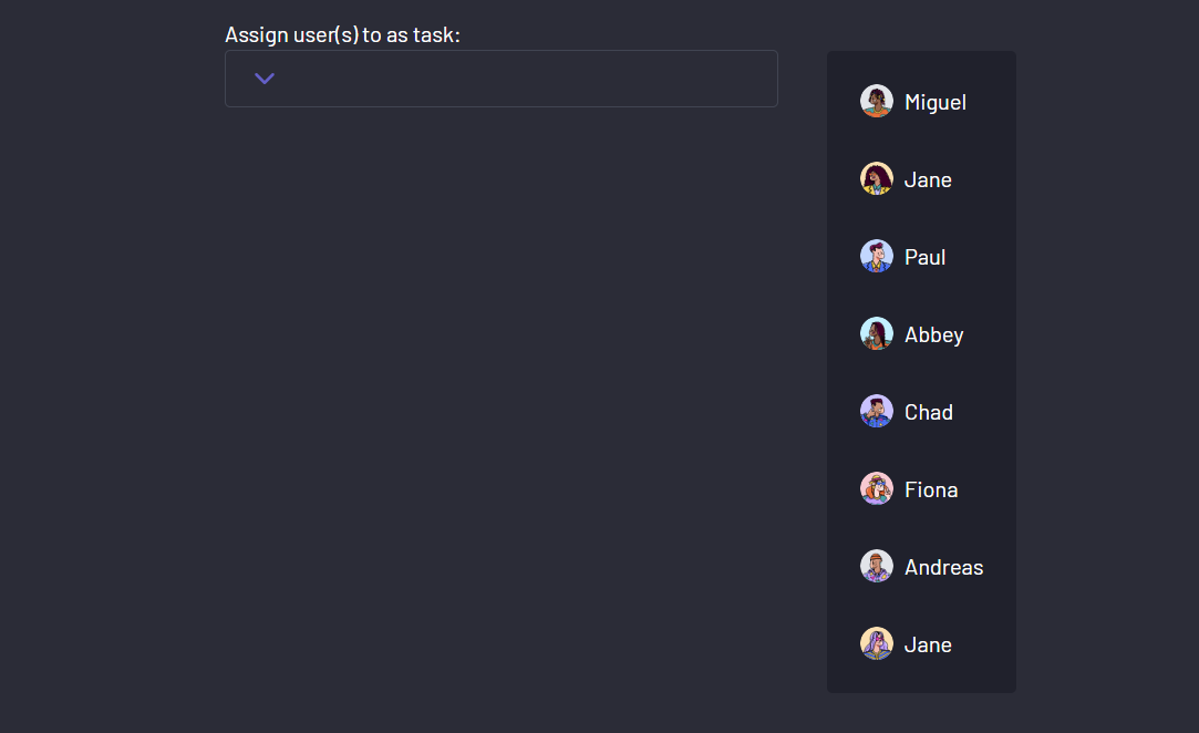 Dropdown list rendered
At the moment, your dropdown list is showing by default. To add the toggle behavior, create a state for its visibility.
const [isDropdownOpen, setIsDropdownOpen] = useState(false);
Then pass down both as props to the Dropdown component.
<Dropdown
 usersArray={usersArray}
 isDropdownOpen={isDropdownOpen}
 setIsDropdownOpen={setIsDropdownOpen}
 />
Before you see the result, attach a toggle function that changes the dropdown state to true to the dropdown button.
const toggleDropdown = () => {
    setIsDropdownOpen(true);
};
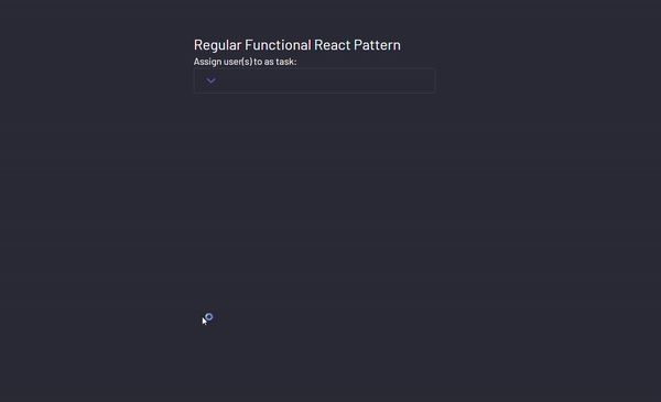
Your dropdown component should now look like this:
const Dropdown = ({ usersArray, setIsDropdownOpen, isDropdownOpen }) => {
  const toggleDropdown = () => {
    setIsDropdownOpen(true);
  };

  return (
    <div>
      <label className="mt-4">Assign user(s) to as task:</label>

      <button
        className="  px-4 w-full py-2 flex items-center justify-between  rounded border border-[#828FA340] hover:border-primary cursor-pointer relative "
        // Function to show the dropdown on click
        onClick={toggleDropdown}>
        <span className="block">
          <FiChevronDown color="#635FC7" size={24} />
        </span>
      // Conditionally rendering your dropdown list
        {isDropdownOpen && (
          <div className="absolute bottom-full translate-x-9  left-full translate-y-full rounded bg-[#20212c] w-max">
            <ul className="flex flex-col p-2">
              {usersArray.map((user) => (
                <li
                  key={user.id}
                  className={`flex items-center gap-2 p-4 hover:bg-[#2b2c37] rounded transition-all duration-200 `}>
                  <img
                    className="w-6 h-6 "
                    src={user.imgUrl}
                    alt={`${user.name} image`}
                  />
                  <span>{user.name}</span>
                </li>
              ))}
            </ul>
          </div>
        )}
      </button>
    </div>
  );
};
Your dropdown now behaves like so:
 Dropdown with list conditionally rendering
I know you’ve noticed your dropdown only opens, but doesn’t close. Don’t worry, we’d fix that later in a much cleaner way. 😉
 Trust the process
Next up, let’s create a way to assign users to the task. Start by creating a state to store the assigned users in the App component.
const [assignedList, setAssignedList] = useState([]);
Then pass in the values as props to the Dropdown component.
<Dropdown
  usersArray={usersArray}
  isDropdownOpen={isDropdownOpen}
  setIsDropdownOpen={setIsDropdownOpen}
  assignedList={assignedList}
  setAssignedList={setAssignedList}
/>
To assign users to the task, create a handler function which first checks if the user you're trying to add is already in the array, adds them if they're not, and removes them if they are.
  function handleAssign(user) {
    setAssignedList((prevList) => {
      // Check if the user already exists in the list
      if (prevList.includes(user)) {
        // If user exists, remove it from the list
        const updatedList = prevList.filter((item) => item !== user);
        return updatedList;
      } else {
        // If user doesn't exist, add it to the list
        return [...prevList, user];
      }
    });
  }
To confirm this function works, use the assignedList array to add a check icon to every assigned user.
<ul className="flex flex-col p-2">
  {usersArray.map((user) => (
    <li
      key={user.id}
      className={`flex items-center gap-2 p-4 hover:bg-[#2b2c37] rounded transition-all duration-200 `}
      onClick={() => handleAssign(user)}
    >
      {assignedList.includes(user) && <FiCheck />}

      <img
        className="w-6 h-6 "
        src={user.imgUrl}
        alt={`${user.name} image`}
      />
      <span>{user.name}</span>
    </li>
  ))}
</ul>
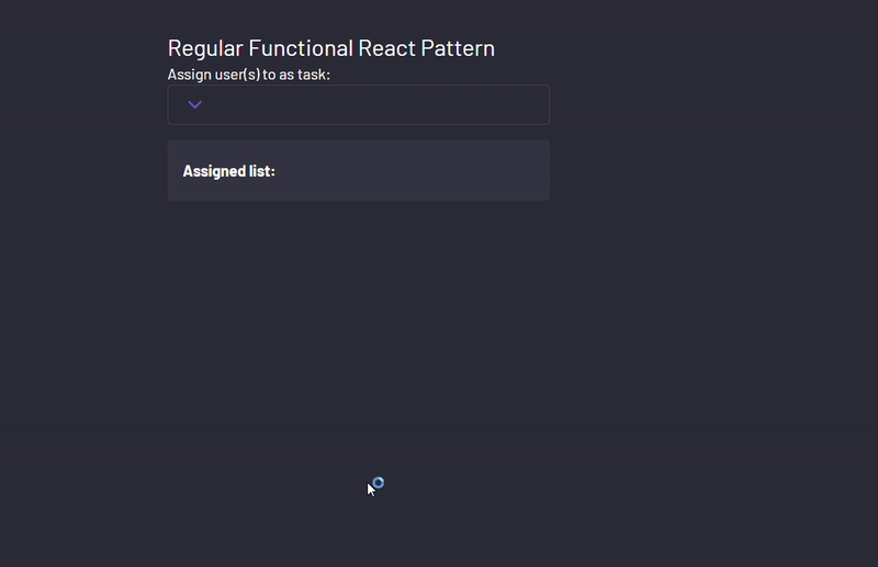
With this change, the dropdown should assign and unassign users on the click of each user.
 Assigning and unassigning users to the task
To improve the UI, let’s create a component which shows all the assigned users.
Create an AssignedList component and pass in its respective states.
 <AssignedList
   assignedList={assignedList}
   setAssignedList={setAssignedList}
  />
Then use the assigned array to create some JSX.
function AssignedList({ assignedList, setAssignedList }) {
  return (
    <div className="mt-4 p-2 shadow-sm bg-[#828fa318] rounded">
      <h2 className="px-2 my-3 font-bold">Assigned list:</h2>
      <div className="flex flex-wrap gap-4 ">
        {assignedList?.map((user, index) => (
          <div
            key={user.id}
            className="flex items-center gap-1 w-[47.5%] p-2 hover:bg-[#20212c] rounded transition-all duration-200">
            <span>{index + 1}.</span>
            <img
              className="w-6 h-6 "
              src={user.imgUrl}
              alt={`${user.name} image`}
            />

            <span>{user.name}</span>
            <span className="ml-auto cursor-pointer p-1 hover:bg-[#2b2c37] rounded-full">
              <FaXmark />
            </span>
          </div>
        ))}
      </div>
    </div>
  );
}
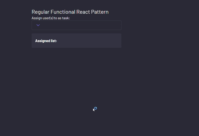
Testing out your component now yields:
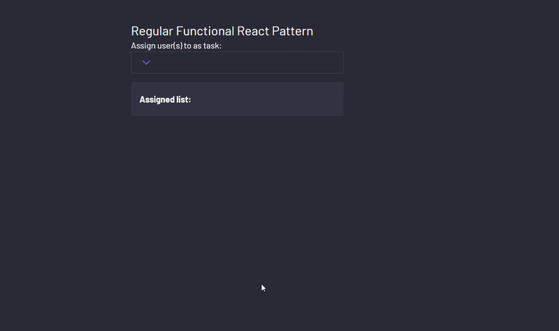 Displaying assigned users using the AssignedList component
One of the final touches would be to use the x icon to remove a user from the assignment.
This can be done using the setAssigned function to filter out the user based on their id.
function handleRemove(id) {
    setAssignedList((assignedList) =>
      assignedList.filter((user) => user.id !== id)
    );
  }
Then pass in the user id from the loop.
function AssignedList({ assignedList, setAssignedList }) {
  function handleRemove(id) {
    setAssignedList((assignedList) =>
      assignedList.filter((user) => user.id !== id)
    );
  }
  return (
    <div className="mt-4 p-2 shadow-sm bg-[#828fa318] rounded">
      <h2 className="px-2 my-3 font-bold">Assigned list:</h2>
      <div className="flex flex-wrap gap-4 ">
        {assignedList?.map((user, index) => (
          <div
            key={user.id}
            className="flex items-center gap-1 w-[47.5%] p-2 hover:bg-[#20212c] rounded transition-all duration-200"
            onClick={() => handleRemove(user.id)}>
            <span>{index + 1}.</span>
            <img
              className="w-6 h-6 "
              src={user.imgUrl}
              alt={`${user.name} image`}
            />

            <span>{user.name}</span>
            <span className="ml-auto cursor-pointer p-1 hover:bg-[#2b2c37] rounded-full">
              <FaXmark />
            </span>
          </div>
        ))}
      </div>
    </div>
  );
}
This gives:
 Removing users from assignment using the AssignedList component
Another final touch would be to close the dropdown list at some user interaction.
To begin, I like using a reusable hook for this, which takes in a reference element and a function to fire when any area outside my target element is clicked.
import { useEffect } from "react";

const useClickOutside = (ref, handler) => {
  // console.log(handler, ref);
  useEffect(() => {
    const listener = (event) => {
      // Do nothing if clicking ref's element or descendent elements
      if (!ref.current || ref.current.contains(event.target)) {
        return;
      }

      handler(event);
    };

    document.addEventListener("mousedown", listener);
    document.addEventListener("touchstart", listener);

    return () => {
      document.removeEventListener("mousedown", listener);
      document.removeEventListener("touchstart", listener);
    };
  }, [ref, handler]);
};

export default useClickOutside;
Then in our App component, create a ref using the useRef hook to select an element.
const dropdownContainerRef = useRef(null);
Then assign it to your preferred element.
export default function App() {
  const [isDropdownOpen, setIsDropdownOpen] = useState(false);

  const [assignedList, setAssignedList] = useState([]);

  const dropdownContainerRef = useRef(null);


  return (
    <div className="bg-[#2b2c37] h-[100dvh] text-white flex  p-20 gap-4 items-center flex-col">
      <div className=" w-[400px] " ref={dropdownContainerRef}>
        <h1 className="text-2xl ">Regular Functional React Pattern</h1>
        <Dropdown
          usersArray={usersArray}
          isDropdownOpen={isDropdownOpen}
          setIsDropdownOpen={setIsDropdownOpen}
          assignedList={assignedList}
          setAssignedList={setAssignedList}
        />
        <AssignedList
          assignedList={assignedList}
          setAssignedList={setAssignedList}
        />
      </div>
    </div>
  );
}
Finally, import your hook and pass in the reference element and the function handler function for closing the dropdown.
 useClickOutside(dropdownContainerRef, () => {
    setIsDropdownOpen(false);
  });
Testing your component now gives:
 Closing the dropdown component with outside clicks
Or using a predefined button in the dropdown.
<button
  className="px-4 w-full py-2 flex items-center justify-between rounded border border-[#828FA340] hover:border-primary cursor-pointer relative"
  onClick={toggleDropdown}
>
  <span className="block">
    <FiChevronDown color="#635FC7" size={24} />
  </span>
  {isDropdownOpen && (
    <div className="absolute bottom-full translate-x-9 left-full translate-y-full rounded bg-[#20212c] w-max">
      {/* Close button */}
      <div
        className="absolute top-0 right-0 flex items-center justify-center -translate-y-full gap-2 bg-[#C0392B] px-2 py-1 rounded-t"
        onClick={(e) => {
          e.stopPropagation();
          setIsDropdownOpen(false);
          console.log(isDropdownOpen);
        }}
      >
        <span>Close</span>
        <span>
          <FaXmark size={20} />
        </span>
      </div>
      <ul className="flex flex-col p-2">
        {usersArray.map((user) => (
          <li
            key={user.id}
            className={`flex items-center gap-2 p-4 hover:bg-[#2b2c37] rounded transition-all duration-200`}
            onClick={() => handleAssign(user)}
          >
            {assignedList.includes(user) && <FiCheck />}
            <img
              className="w-6 h-6"
              src={user.imgUrl}
              alt={`${user.name} image`}
            />
            <span>{user.name}</span>
          </li>
        ))}
      </ul>
    </div>
  )}
</button>
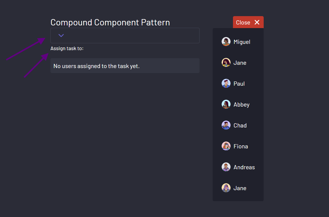
 Closing the dropdown with the designated button
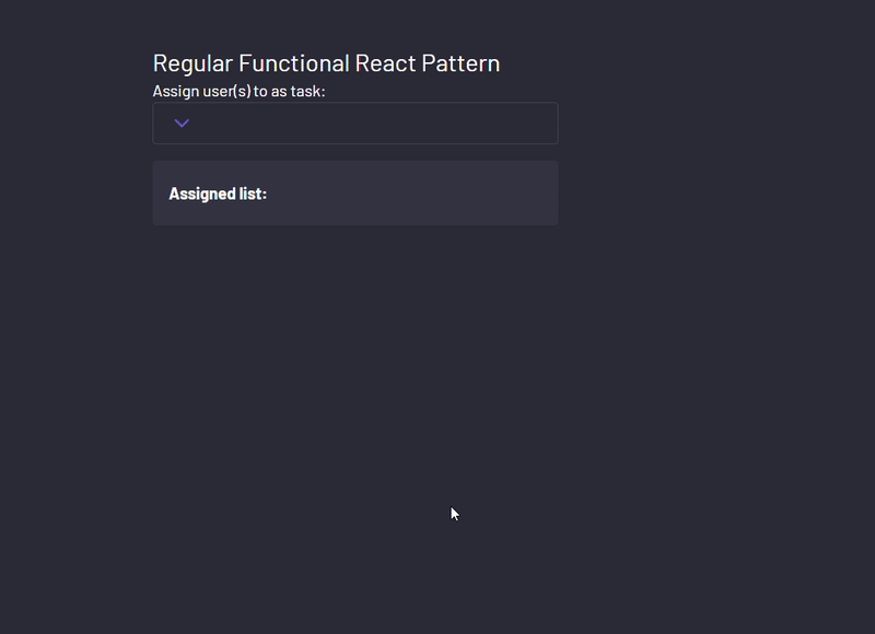
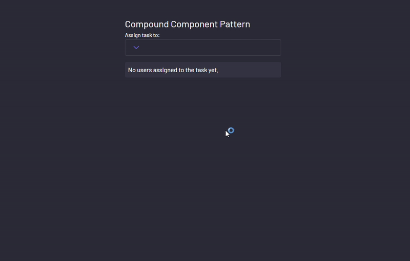
The final change is an opinionated one as I’d rather show something else if there aren’t any users currently assigned to the task.
{assignedList.length === 0 ? (
  <p className="mt-4 p-2 shadow-sm bg-[#828fa318] rounded">
    No users assigned to the task yet.
  </p>
) : (
  <AssignedList
    assignedList={assignedList}
    setAssignedList={setAssignedList}
  />
)}
This brings the UI to:
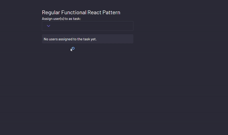 Showing a default text when no users are assigned
The Compound Component Pattern Method
Now, for the main event. Start by creating a context which wraps the entire component.
const UserAssignContext = createContext();
Then we gather all the necessary data and functions that our dropdown and its components will need. This includes things like the list of assigned users, a function to update that list, and whether the dropdown is currently open or not.
After which, you provide those values to all its children component.
const UserAssignDropdown = ({
  children,
  assignedList,
  setAssignedList,
  users,
}) => {
  const UserAssignDropdownRef = useRef(null);
  const [isDropdownOpen, setIsDropdownOpen] = useState(false);

  return (
    <UserAssignContext.Provider
      value={{
        assignedList,
        users,
        UserAssignDropdownRef,
        isDropdownOpen,
        setIsDropdownOpen,
        setAssignedList,
      }}>
      <div ref={UserAssignDropdownRef}>{children}</div>
    </UserAssignContext.Provider>
  );
};
With our context set up, it's time to craft the individual components that will make up our dropdown. Each component will interact with the context to access and manipulate the necessary data and functions.
Start by copying each style from the components we just built.
The Header Component
This component remains the same.
const Header = () => {
  return <label className="mt-4 mb-2 text-sm">Assign task to:</label>;
};
The Close Component
This component obtains the function for toggling the dropdown from the context.
const Close = () => {
  const { setIsDropdownOpen } = useContext(UserAssignContext);
  return (
    <div
      className="absolute top-0 right-0 flex items-center justify-center -translate-y-full gap-2 bg-[#C0392B] px-2 py-1 rounded-t"
      onClick={(e) => {
        e.stopPropagation();
        setIsDropdownOpen(false);
      }}>
      <span>Close</span>
      <span>
        <FaXmark size={20} />
      </span>
    </div>
  );
};
The Assigned List Component
This component displays the list of assigned users, as well as removing users from the list.
const AssignedList = () => {
  const { assignedList, setAssignedList } = useContext(UserAssignContext);

  function handleRemove(id) {
    setAssignedList((assignedList) =>
      assignedList.filter((user) => user.id !== id)
    );
  }

  if (assignedList.length === 0)
    return (
      <p className="mt-4 p-2 shadow-sm bg-[#828fa318] rounded">
        No users assigned to the task yet.
      </p>
    );

  return (
    <div className="mt-4 p-2 shadow-sm bg-[#828fa318] rounded">
      <h2 className="px-2 my-3 font-bold">Assigned list:</h2>
      <div className="flex flex-wrap gap-4 ">
        {assignedList?.map((user, index) => (
          <div
            key={user.id}
            className="flex items-center gap-1 w-[47.5%] p-2 hover:bg-[#20212c] rounded transition-all duration-200"
            onClick={() => handleRemove(user.id)}>
            <span>{index + 1}.</span>
            <img
              className="w-6 h-6 "
              src={user.imgUrl}
              alt={`${user.name} image`}
            />

            <span>{user.name}</span>
            <span className="ml-auto cursor-pointer p-1 hover:bg-[#2b2c37] rounded-full">
              <FaXmark />
            </span>
          </div>
        ))}
      </div>
    </div>
  );
};
The Item Component
This component represents each user and the functionality of adding and removing users from the assigned list.
const Item = ({ user }) => {
  const { assignedList, setAssignedList } = useContext(UserAssignContext);

  function handleAssign(user) {
    setAssignedList((prevList) => {
      // Check if the user already exists in the list
      if (prevList.includes(user)) {
        // If user exists, remove it from the list
        const updatedList = prevList.filter((item) => item !== user);
        return updatedList;
      } else {
        // If user doesn't exist, add it to the list
        return [...prevList, user];
      }
    });
  }

  return (
    <li
      key={user.id}
      className={`flex items-center gap-2 p-4 hover:bg-[#2b2c37] rounded transition-all duration-200 `}
      onClick={() => handleAssign(user)}>
      {assignedList.includes(user) && <FiCheck />}

      <img className="w-6 h-6 " src={user.imgUrl} alt={`${user.name} image`} />
      <span>{user.name}</span>
    </li>
  );
};
The Button Component
This component controls displaying the List component (floating dropdown).
const Button = () => {
  const { setIsDropdownOpen } = useContext(UserAssignContext);
  return (
    <button
      className="  px-4 py-2 flex items-center justify-between w-full rounded border border-[#828FA340] hover:border-primary cursor-pointer relative "
      onClick={() => setIsDropdownOpen(true)}>
      <span className="block">
        <FiChevronDown color="#635FC7" size={24} />
      </span>

      <UserAssignDropdown.List />
    </button>
  );
};
To combine this component into a singular compound component (compound component), you assign each component to the parent, like so;
UserAssignDropdown.List = ListContainer;
UserAssignDropdown.Item = Item;
UserAssignDropdown.Header = Header;
UserAssignDropdown.Button = Button;
UserAssignDropdown.AssignedList = AssignedList;
UserAssignDropdown.Close = Close;
Next, import your compound component in your App component as a wrapper component and pass in the appropriate states.
export default function App() {
  const [assignedList, setAssignedList] = useState([]);

  return (
    <div className="bg-[#2b2c37] h-[100dvh] text-white flex  p-20 gap-4 items-center flex-col">
      <div className=" w-[400px] ">
        <h1 className="text-2xl ">Compound Component Pattern</h1>
        <UserAssignDropdown
          assignedList={assignedList}
          setAssignedList={setAssignedList}
          users={usersArray}></UserAssignDropdown>
      </div>
    </div>
  );
}
Then in the wrapper, render the appropriate children.
export default function App() {
  const [assignedList, setAssignedList] = useState([]);

  return (
    <div className="bg-[#2b2c37] h-[100dvh] text-white flex  p-20 gap-4 items-center flex-col">
      <div className=" w-[400px] ">
        <h1 className="text-2xl ">Compound Component Pattern</h1>
        <UserAssignDropdown
          assignedList={assignedList}
          setAssignedList={setAssignedList}
          users={usersArray}>
          <UserAssignDropdown.Header />
          <UserAssignDropdown.Button />
          <UserAssignDropdown.AssignedList />
        </UserAssignDropdown>
      </div>
    </div>
  );
}
Finally, use the custom hook we created earlier to close the dropdown when you click outside the component.
const UserAssignContext = createContext();
const UserAssignDropdown = ({
  children,
  assignedList,
  setAssignedList,
  users,
}) => {
  const UserAssignDropdownRef = useRef(null);
  const [isDropdownOpen, setIsDropdownOpen] = useState(false);

  useClickOutside(UserAssignDropdownRef, () => {
    setIsDropdownOpen(false);
  });

  return (
    <UserAssignContext.Provider
      value={{
        assignedList,
        users,
        UserAssignDropdownRef,
        isDropdownOpen,
        setIsDropdownOpen,
        setAssignedList,
      }}>
      <div ref={UserAssignDropdownRef}>{children}</div>
    </UserAssignContext.Provider>
  );
};
And with that, your component works the same!
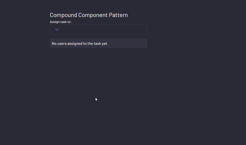 Replicating the same functionality with the compound component pattern
But why stop here?
With this pattern, changing the look of the component is as easy as changing the order in which you render them in their parent. For instance, if you wanted the button first, you simply change the order in the parent wrapper.
<UserAssignDropdown
  assignedList={assignedList}
  setAssignedList={setAssignedList}
  users={usersArray}
>
  <UserAssignDropdown.Button />
  <UserAssignDropdown.Header />
  <UserAssignDropdown.AssignedList />
</UserAssignDropdown>
And the UI responds accordingly.
 Order of rendering in compound component changed
This component is also flexible enough to change the layout of elements via props.
Just by passing style props via a parent:
<UserAssignDropdown
  assignedList={assignedList}
  setAssignedList={setAssignedList}
  users={usersArray}
>
  <UserAssignDropdown.Header />
  <UserAssignDropdown.Button
    listStyles={"!-left-5 !-translate-x-full bg-[#605e80] text-white border"}
  />
  <UserAssignDropdown.AssignedList />
</UserAssignDropdown>
And receiving those props in the child:
const Button = ({ listStyles }) => {
  const { setIsDropdownOpen, UserAssignDropdownRef } =
    useContext(UserAssignContext);
  return (
    <button
      className="  px-4 py-2 flex items-center justify-between w-full rounded border border-[#828FA340] hover:border-primary cursor-pointer relative "
      ref={UserAssignDropdownRef}
      onClick={() => setIsDropdownOpen(true)}>
      <span className="block">
        <FiChevronDown color="#635FC7" size={24} />
      </span>
      <UserAssignDropdown.List listStyles={listStyles} />
    </button>
  );
};

const ListContainer = ({ listStyles }) => {
  const { users, isDropdownOpen } = useContext(UserAssignContext);

  return (
    isDropdownOpen && (
      <ul
        className={`absolute bottom-full translate-x-9  left-full translate-y-full rounded bg-[#20212c] w-max ${listStyles}`}>
        <UserAssignDropdown.Close />
        <div className="flex flex-col p-2">
          {users?.map((user, index) => (
            <UserAssignDropdown.Item key={index} user={user} />
          ))}
        </div>
      </ul>
    )
  );
};
You can easily change the look of the component.
 Using props to customize the compound component
Comparison between the Regular and the Compound Component method
Alright, let's take a step back and compare the two approaches we've just explored.
Simplicity and Organization
- Regular Method: Picture it like baking a cake all in one big bowl. With the regular method, we can create a single component responsible for everything in the dropdown – the button, the list, and all the ingredients. It's like having a big recipe card with all the steps jumbled together. It gets the job done, but it can be a bit messy and hard to follow, especially when you're trying to tweak just one part of the recipe.
- Compound Component Method: Now imagine we've got different bowls for each ingredient, a separate one for flour, another for sugar, and so on. That's the compound component pattern. Each part of the dropdown has its own space to shine. It's like organizing your kitchen – everything has its place. This makes it easier to understand and modify. Need to change the flour? You know just where to look.
Flexibility and Customization
- Regular Method: With our single-bowl approach, making changes to specific parts of the dropdown can be a bit like trying to swap out ingredients in that big cake mix. Sure, you can do it, but it's not always easy. Want a different flavor of cake? You might need to dig through the whole bowl to find where to add it.
- Compound Component Method: With the compound component pattern, it's like having separate containers for each flavor. Need to add chocolate chips? Just grab the chocolate container and sprinkle away. Each component has its job, making it simpler to customize. Want to change the color of the button? No problem, it's right there in its container.
Reuse and Maintenance
- Regular Method: When your recipe is all mixed up in one bowl, it can be hard to reuse parts of it for another dish. Plus, as your kitchen gets busier, it's easy for things to get messy and hard to keep track of. You might find yourself rewriting the recipe every time you want to make something new.
- Compound Component Method: With the compound component pattern, it's like having a set of reusable tools in your kitchen. Need to make a different kind of cake? Just grab the tools you need and get baking. Each component is like a specialized gadget – easy to reuse and maintain. And when your kitchen is organized, it's a breeze to whip up something new.
Additional Information
Here are links to all the resources you may need from this article.
Conclusion
In the end, both methods have their place in the kitchen – er, I mean, in your code. The regular method is like your trusty old mixing bowl – reliable and familiar, but maybe not the most efficient for every recipe.
The compound component Pattern is like a well-organized kitchen, with everything in its place and ready to go. It might take a bit more setup, but it can make your life a whole lot easier in the long run. So, depending on what you're cooking up, choose the method that suits your taste– and happy coding! 🍰🎨
Contact Information
Want to connect or contact me? Feel free to hit me up on the following:
- Twitter / X: @jajadavid8
- LinkedIn: David Jaja
- Email: Jajadavidjid@gmail.com