

If you've built a couple of React Native apps, the following probably feels familiar. You start with a colors.ts file and a simple Button component. Everything looks fine at first. Then the design changes a few times, and that small color file starts growing. Your Button also picks up another prop every time someone asks for a slightly different style.
The setup works at first, but after a few design changes, even a small update can mean checking several files across the project.
Here's what a typical color file looks like after a while:
export const colors = {
  primary: '#6e4836',
  primaryPressed: '#5a3a2b',
  textPrimary: '#261d16',
  textSecondary: '#72665e',
  // and forty more
};
And here's what a typical Button looks like after a few redesigns:
<Button
  variant="primary"
  size="md"
  fullWidth
  loading={busy}
  containerStyle={styles.checkoutButton}
  labelStyle={styles.checkoutLabel}
/>
These are simplified examples, but you get the idea. The color object keeps growing, and the Button collects more props to handle every new design request.
Each change seems reasonable when you make it. But the annoying part comes later, when changing one design decision means checking several files to see that nothing else has changed unexpectedly.
Part of the problem is how many component libraries are distributed. Their code lives in node_modules, so you usually customize them through the props and options they expose. When the library doesn't cover your exact use case, you add another prop or override. Keep doing that and the component can become harder to maintain than the original problem you were trying to solve.
This is one reason I like shadcn/ui's approach. You don't install a traditional component package and treat its components as fixed. The CLI copies the source code into your project, where you can change it whenever you need to. For React Native, there's a project built around the same idea called React Native Reusables.
To make this practical, I'll use React Native Reusables, Expo, and Uniwind to build a cart and checkout screen for a coffee shop's pickup orders. It includes order items with quantity controls, a pickup-time dropdown, a name field, an "own cup" toggle, a bill summary, a checkout bar that stays at the bottom, and an order-confirmation dialog. If you want to see how reusable sections come together in complete interfaces, you can also browse shadcn templates.
I'll also point out a few things that are easy to miss when working with these components, including:
- How shadcn/ui and its CLI work, and why you own the component code
- How design tokens (named colors) replace a
colors.tsfile - How to use components such as Card, Select, Switch, and AlertDialog in React Native
- How to handle mobile-specific issues, such as safe areas, keyboards, and tap targets
- How to switch between light and dark mode, and how to change the whole theme from one file
Table of Contents
- Prerequisites
- Tools You Will Use
- How shadcn/ui Works
- What React Native Reusables Gives You
- What You're Building
- Step 1: Create the App
- Step 2: Understand the Theme File
- Step 3: Read Three Core Components
- Step 4: Add the Components You Need
- Step 5: Set Up the Data and the Screen
- Step 6: Build the Order Rows
- Step 7: Build the Pickup Options
- Step 8: Build the Bill Component
- Step 9: Build the Fixed Checkout Bar
- Step 10: Add the Confirmation and Put the Screen Together
- Step 11: Add Dark Mode
- Step 12: Create Your Own Theme
- Common Mistakes and How to Fix Them
- Conclusion
Prerequisites
To follow along, you should have:
- Node.js 20 or newer. You can use pnpm, npm, yarn, or bun. The commands in this tutorial use pnpm, so swap the prefix if you use something else.
- Basic knowledge of React and TypeScript, especially hooks such as
useState. - Some familiarity with React Native, such as
View,Text, andScrollView. You don't need to know Tailwind, but it helps. - Optional: Xcode or Android Studio if you want to run the app in a simulator. Everything also runs in a web browser through React Native Web, and that's how the screenshots in this tutorial were taken.
You don't need any accounts or API keys, and nothing here costs money.
Tools You Will Use
Before creating the app, let's look at the tools in this project. Each one has a specific job, and knowing that will make the setup easier to follow.
shadcn/ui is a collection of UI components for the web. It's not installed as a package. Instead, a command-line tool (CLI) copies the source code of each component into your project, and from then on the code is yours to edit.
React Native Reusables is the React Native version of shadcn/ui. It gives you components such as Button, Card, Select, and Dialog that are written for React Native and styled with Tailwind-style class names. It uses the same CLI idea as shadcn/ui.
RN Primitives is a React Native port of Radix UI, which is the library that shadcn/ui uses for behavior on the web. A "primitive" is a component that handles the behavior but has no styling. For example, the select primitive knows how a dropdown opens and closes and how it's announced to screen readers, but it has no colors or borders. React Native Reusables adds the looks on top.
Uniwind is a tool that lets you style React Native components with Tailwind CSS class names, such as className="bg-primary p-4". It converts those classes into regular React Native styles while the app is being bundled, so there's no extra work at runtime. Nativewind does a similar job, and React Native Reusables supports both. This tutorial uses Uniwind.
Expo and Expo Router provide the project setup, the development server, and file-based navigation. If you have used Next.js, Expo Router works in a similar way.
How shadcn/ui Works
The React Native Reusables documentation opens with a quote from shadcn:
This is not a component library. It is how you build your component library.
You won't add shadcn/ui as a regular dependency in package.json. It uses a registry instead. A registry is a collection of JSON files hosted on a server. Each file describes a component and includes the information the CLI needs to add it to your project. When you run the CLI, it reads the relevant file and copies the component's source code into your project.
To see what this looks like, here's the registry entry for the Badge component. A Badge is a small label, such as the "Medium" tag next to a coffee in the cart you will build later. This is a shortened version of the real file:
{
  "$schema": "https://ui.shadcn.com/schema/registry-item.json",
  "name": "badge",
  "type": "registry:ui",
  "title": "Badge",
  "author": "@mrzachnugent",
  "description": "Displays a badge or a component that looks like a badge.",
  "dependencies": ["@rn-primitives/slot"],
  "registryDependencies": ["https://reactnativereusables.com/r/uniwind/text.json"],
  "files": [
    {
      "path": "./node_modules/@rnr/registry/src/uniwind/components/ui/badge.tsx",
      "content": "import { TextClassContext } from '@/components/ui/text';\nimport ...",
      "type": "registry:ui"
    }
  ]
}
The file is public, so you can look at it yourself:
curl https://reactnativereusables.com/r/uniwind/badge.json
Here's what the important fields mean:
contentholds the full source code of the component, stored as a string.dependencieslists npm packages that the component needs. The CLI installs these first.registryDependencieslists other registry entries that the component needs. In this case, Badge needs the Text component, which is a small wrapper around React Native'sTextthat you will read about in Step 3. When you run the CLI to add Badge, it also adds Text for you because of this field.
That's how a component gets from the registry into your app. The registry stores the component information, and the CLI uses it to create the files in your repository. React Native Reusables uses the shadcn CLI behind the scenes, so you can follow the same workflow when adding React Native components.
There are a few reasons this approach is useful when you're building an app:
- You own the file: A component such as
components/ui/button.tsxsits in your repository and shows up in your Git diffs. If you want a darker pressed state, you edit that line. You don't need to invent a new prop, maintain a fork, or open an issue. - Design lives in named colors instead of props: Colors are declared once as named roles, such as
primary,muted,border, anddestructive. You then use them in class names, likeclassName="bg-primary". This replaces thecolors.tsfile from the introduction, because there's one place that defines your colors, and every component reads from it. You'll set this up in Step 2. - Behavior comes from a separate package: Things such as focus handling, open and close state, and screen reader support live in RN Primitives. You only write the styling.
There's one trade-off to keep in mind. Since the component code is copied into your project, updates from the registry aren't applied automatically. If a bug is fixed upstream, you'll need to run the CLI again with --overwrite. If you have customized that component, you may also need to reapply your changes. This is worth considering before you make large changes to several components.
What React Native Reusables Gives You
At the time of writing, React Native Reusables includes thirty components: accordion, alert, alert-dialog, aspect-ratio, avatar, badge, button, card, checkbox, collapsible, context-menu, dialog, dropdown-menu, hover-card, input, label, menubar, popover, progress, radio-group, select, separator, skeleton, switch, tabs, text, textarea, toggle, toggle-group, and tooltip. The available components cover many of the building blocks you need for a typical app interface.
React Native is different from the web in several ways, so the components can't be an exact copy of the web version. The documentation lists the main differences, and you'll run into each of them in this tutorial. If you're also building web interfaces with shadcn/ui, shadcn components can be useful when you need more ready-made examples to work from.
| The difference | What it means | Where you will see it |
|---|---|---|
Portals need a PortalHost |
On the web, floating content such as dropdowns renders into document.body. React Native has no document.body, so you need a PortalHost component to render into. |
Step 7 |
| Styles don't cascade | A text color set on a parent view doesn't reach the text inside it, so React Native Reusables uses a Text component with a workaround. |
Step 3 |
There are no data-* attributes |
Web shadcn changes styles based on attributes like data-state. React Native has none, so variants depend on props and state. |
Step 7 |
| Icons take props instead of classes | Icon libraries expect color and size props, so icons are wrapped to accept class names. |
Step 3 |
What You're Building
We'll build a cart and checkout screen for a coffee shop where customers place an order and pick it up at the counter. The screen uses twelve components from the registry. While putting it together, I'll also explain a few React Native details that are easy to miss, including how dropdowns are rendered, how safe areas affect the layout, and how to keep the checkout bar visible while the rest of the page scrolls:
| Part of the screen | Components used | The mobile problem it teaches |
|---|---|---|
| Item rows | Card, Avatar, Badge, Button | No cascading styles, no truncate, small tap targets |
| Quantity stepper | Button, Icon | Icons take props, not classes |
| Pickup time | Select, Label | Dropdowns need a portal |
| Name field | Input, Label | The keyboard can cover the field |
| Own cup toggle | Switch, Label | Making the label text tappable |
| Bill | Separator, Text | Digits that don't line up |
| Checkout bar | Button, AlertDialog | No position: fixed, and the home indicator |
Here's the finished screen:
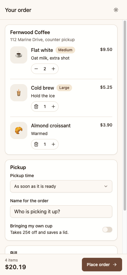
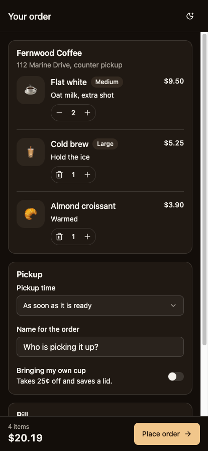
The complete code is available in the GitHub repository if you want to compare your work with the final result.
Step 1: Create the App
We can let the React Native Reusables CLI create the initial project for us. It sets up Expo Router, the styling configuration, the theme file, and a few starter components. Run the following command to get started:
pnpm dlx @react-native-reusables/cli@latest init
Answer the CLI's Questions
The CLI asks four questions.
What is the name of your project? The name you type becomes the folder name. It suggests my-app.
Select a template. There are three options, and the one you need isn't the one selected by default:
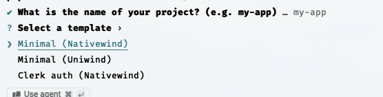
❯ Minimal (Nativewind)
  Minimal (Uniwind)
  Clerk auth (Nativewind)
Press the down arrow once and choose Minimal (Uniwind). This is the one choice that's tricky to change later. Nativewind and Uniwind are two different ways to use Tailwind in React Native, and the CLI keeps a separate registry for each one. The components it writes for Uniwind are different from the ones it writes for Nativewind, so the code in this tutorial won't match if you pick Nativewind.
Would you like to install dependencies? Choose yes, and select the package manager you use.
Would you like to initialize a Git repository? Choose yes. You're about to replace the starter screen, and having a commit to compare against is helpful.
Look at the Project Structure
The CLI creates the following files:
shadcn-react-native-app/
├── app/
│   ├── _layout.tsx        # ThemeProvider, Stack, and the PortalHost
│   ├── +html.tsx          # web only, the root HTML shell
│   ├── +not-found.tsx
│   └── index.tsx          # the starter screen
├── components/ui/
│   ├── button.tsx
│   ├── icon.tsx
│   └── text.tsx
├── lib/
│   ├── theme.ts           # the same palette again, in JavaScript
│   └── utils.ts           # cn()
├── global.css             # the theme tokens
├── components.json        # the shadcn config, same as on the web
├── metro.config.js        # withUniwindConfig
└── uniwind-types.d.ts     # generated, do not edit
Before moving on, let's take a look at a few files in this structure. You'll use them throughout the tutorial:
components.jsonis the same shadcn configuration file used on the web. It tells the CLI where to put components (@/components/ui) and where thecn()helper lives (@/lib/utils).global.cssholds your theme tokens, which you'll learn about in Step 2.lib/utils.tsexportscn(), a helper that combines class names and resolves conflicts between them.app/_layout.tsxcontains aPortalHostcomponent. It looks like leftover scaffolding, but you must not delete it. Step 7 explains why.
Uniwind reads global.css while Metro bundles the app and turns your class strings into React Native style objects. This happens at build time, so a long className string doesn't slow down your app.
Run the App
Start the development server:
pnpm dev
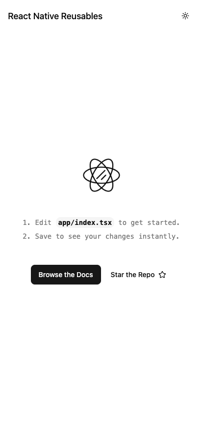
Press w to open it in the browser, i for the iOS simulator, or a for Android. The starter screen has a theme toggle in the header, which shows that the theme setup is working.
You can also run a diagnostic command at any point if something seems wrong:
pnpm dlx @react-native-reusables/cli@latest doctor
It checks your setup and reports which styling library it detects. For this project, the output should be:
ℹ Styling Library: Uniwind
✔ All checks passed.
If it says Nativewind, fix that before you add any components.
Once the setup is working, you should see the starter screen. Try the theme toggle in the header to make sure light and dark mode both work, and check that the console is free of errors:
Step 2: Understand the Theme File
Now that the app is running, let's look at its theme setup. The global.css file is where we'll define the colors used by the components. If you've previously kept these values in a colors.ts or theme.ts file, this is the setup that replaces it.
@import "tailwindcss";
@import "uniwind";

@import "tw-animate-css";

@theme {
  --radius: 10px;
  --radius-sm: calc(var(--radius) - 4px);
  --radius-md: calc(var(--radius) - 2px);
  --radius-lg: var(--radius);
  --radius-xl: calc(var(--radius) + 4px);

  --spacing-hairline: hairlineWidth();
}

@layer theme {
  :root {
    @variant light {
      --color-background: oklch(1 0 0);
      --color-foreground: oklch(0.145 0 0);
      --color-card: oklch(1 0 0);
      --color-primary: oklch(0.205 0 0);
      --color-muted-foreground: oklch(0.556 0 0);
      --color-border: oklch(0.922 0 0);
      /* the rest of the list */
    }

    @variant dark {
      --color-background: oklch(0.145 0 0);
      --color-foreground: oklch(0.985 0 0);
      --color-card: oklch(0.205 0 0);
      --color-primary: oklch(0.922 0 0);
      --color-muted-foreground: oklch(0.708 0 0);
      --color-border: oklch(1 0 0 / 10%);
      /* the rest of the list */
    }
  }
}
There are two conventions in this file that you need to know.
First, the --color- prefix creates the class names. When you declare --color-primary, Tailwind automatically creates bg-primary, text-primary, and border-primary. If you declare --primary instead, you only get a CSS variable that nothing uses.
This is important because most shadcn theme generators produce the web format, where the variables are named --primary. If you paste that output without renaming the variables, nothing breaks, but nothing changes either. Step 12 shows you how to convert them.
Second, @variant light and @variant dark replace :root and .dark. On the web, dark mode works by adding a .dark class to the page. A phone has no page to add a class to, so Uniwind manages the switch. When you call Uniwind.setTheme, it swaps the active values. You'll use this in Step 11.
You may also notice that the file uses oklch() colors. Phones don't have a browser to read that format, but Uniwind converts the colors to a format React Native understands while bundling, so you can use modern color syntax anyway.
The Palette Also Exists in lib/theme.ts
If you open lib/theme.ts, you'll find the same colors again as a JavaScript object. This duplication is needed because React Navigation, which draws the header and screen background, reads colors from a plain JavaScript object and can't read CSS variables. As a result, you have to keep two copies of your palette in sync. Step 12 shows what happens when they differ.
Try It: Change One Color
Let's change one of the tokens to see how the theme works. Update the primary color in the light theme to a value that's easy to notice:
--color-primary: oklch(0.6 0.24 25);
Save the file and look at the starter screen. The Browse the Docs button is now red, even though you didn't edit button.tsx:
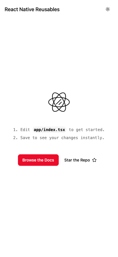
Notice that every component using bg-primary picks up the new color. You only changed one token, but the button updated without touching its component file. Change the value back before continuing.
Step 3: Read Three Core Components
The starter project already gives us three components: Text, Button, and Icon. I'd take a few minutes to look through them before building the screen. They introduce patterns you'll see again in the other registry components.
The Text Component
In React Native, styles don't cascade the way they do in CSS. If you set a text color on a View, the text inside it doesn't inherit that color. This is a problem for a component such as <Button variant="destructive">, which needs its label to be white. The label is a Text component that the Button doesn't control, because it comes in through children. On the web, the Button would simply set a color and let it flow down to the label.
React Native Reusables solves this with React context. This is the code in components/ui/text.tsx:
const TextClassContext = React.createContext<string | undefined>(undefined);

function Text({ className, asChild = false, variant = 'default', ...props }) {
  const textClass = React.useContext(TextClassContext);
  const Component = asChild ? Slot : RNText;
  return (
    <Component
      className={cn(textVariants({ variant }), textClass, className)}
      role={variant ? ROLE[variant] : undefined}
      aria-level={variant ? ARIA_LEVEL[variant] : undefined}
      {...props}
    />
  );
}
A parent component, such as Button, puts a class string into the context. Every Text inside it reads that string and applies it. Your own className still wins because it comes last in the cn() call.
The Text component also has a variant prop with options like h1 to h4, p, code, lead, large, small, and muted. For example, <Text variant="muted"> gives you the mobile version of text-muted-foreground text-sm. The variants also set the role and aria-level props, so screen readers announce headings correctly without any extra work.
The Button Component
The Button in components/ui/button.tsx uses cva (class-variance-authority) the same way the web version does. Here's a shortened version:
const buttonVariants = cva(
  cn(
    'group shrink-0 flex-row items-center justify-center gap-2 rounded-md shadow-none',
    Platform.select({
      web: "focus-visible:border-ring focus-visible:ring-ring/50 ... transition-all",
    })
  ),
  {
    variants: {
      variant: {
        default: cn(
          'bg-primary active:bg-primary/90 shadow-sm shadow-black/5',
          Platform.select({ web: 'hover:bg-primary/90' })
        ),
        /* ... */
      },
    },
  }
);
There are four differences from the web version:
flex-rowis written out: React Native lays out children in a column by default, which is the opposite of CSS. Every horizontal layout in this tutorial includesflex-rowfor that reason.active:replaceshover:: A finger can't really hover, soactive:is the pressed state on a phone.- Web-only classes are wrapped in
Platform.select: Classes such asfocus-visible:ring-[3px]mean nothing in React Native, so they're only included in the web build. - A
TextClassContext.Providerwraps thePressable: This uses the context from the previous section, and it's why<Button variant="destructive"><Text>Delete</Text></Button>has white text automatically.
The Icon Component
Icons from lucide-react-native take color and size as props, not as class names. The Icon component in components/ui/icon.tsx teaches Uniwind how to convert one into the other:
const StyledIcon = withUniwind(IconImpl, {
  size: { fromClassName: 'className', styleProperty: 'width' },
  color: { fromClassName: 'className', styleProperty: 'color' },
});
This code reads the width from the class string and passes it as size, and it reads the color and passes it as color. That's why <Icon as={PlusIcon} className="size-4 text-muted-foreground" /> works the way you would expect. withUniwind is useful any time you use a third-party component that takes props where you want to use classes.
You don't need to run anything for this step. The important part is understanding what TextClassContext is doing. Once that clicks, the other components in the registry are much easier to follow.
Step 4: Add the Components You Need
We already have three components from the template. For the checkout screen, we need a few more. The CLI can add all of them in one go:
pnpm dlx @react-native-reusables/cli@latest add card separator input label select switch badge alert-dialog avatar
The CLI detects that you're using Uniwind and writes the matching versions. It also installs any required @rn-primitives packages and adds a file called native-only-animated-view.tsx, which Select and AlertDialog use for their animations.
The output looks like this:
ℹ Styling Library: Uniwind
✔ Created 10 files:
  - components/ui/separator.tsx
  - components/ui/input.tsx
  - components/ui/label.tsx
  - components/ui/switch.tsx
  - components/ui/avatar.tsx
  - components/ui/native-only-animated-view.tsx
  - components/ui/card.tsx
  - components/ui/badge.tsx
  - components/ui/select.tsx
  - components/ui/alert-dialog.tsx
ℹ Skipped 3 files: (files might be identical, use --overwrite to overwrite)
  - components/ui/text.tsx
  - components/ui/icon.tsx
  - components/ui/button.tsx
The CLI created ten files, which is more than the nine you asked for, because native-only-animated-view.tsx is a dependency of Select and AlertDialog. It skipped the three files that the template already gave you, so it does not overwrite your copies. This is the "you own the file" idea at work.
Run pnpm dev again to make sure the app still starts. The components/ui/ folder should now contain thirteen files.
Step 5: Set Up the Data and the Screen
Before we start building the UI, let's add the sample menu data and decide where the screen state will live. I'm going to store prices in cents rather than floating-point numbers. This avoids calculation results such as $4.7499999.
We'll also keep the state in the main screen component and pass the relevant values down as props. That way, changing an item quantity or selecting the own-cup option automatically updates the bill.
Create lib/menu.ts:
export type CartItem = {
  id: string;
  name: string;
  detail: string;
  size?: 'Small' | 'Medium' | 'Large';
  emoji: string;
  /** Cents. Money in floats is how you end up charging someone $4.7499999. */
  unitPrice: number;
  qty: number;
};

export const INITIAL_CART: CartItem[] = [
  {
    id: 'flat-white',
    name: 'Flat white',
    detail: 'Oat milk, extra shot',
    size: 'Medium',
    emoji: '☕️',
    unitPrice: 475,
    qty: 2,
  },
  {
    id: 'cold-brew',
    name: 'Cold brew',
    detail: 'Hold the ice',
    size: 'Large',
    emoji: '🧋',
    unitPrice: 525,
    qty: 1,
  },
  {
    id: 'croissant',
    name: 'Almond croissant',
    detail: 'Warmed',
    emoji: '🥐',
    unitPrice: 390,
    qty: 1,
  },
];

export const PICKUP_TIMES = [
  { value: 'asap', label: 'As soon as it is ready' },
  { value: '15', label: 'In 15 minutes' },
  { value: '30', label: 'In 30 minutes' },
  { value: '60', label: 'In an hour' },
];

export const CUP_DISCOUNT = 25;
export const TAX_RATE = 0.0825;

export function money(cents: number) {
  const sign = cents < 0 ? '-' : '';
  return `${sign}$${(Math.abs(cents) / 100).toFixed(2)}`;
}

export function billFor(items: CartItem[], ownCup: boolean) {
  const subtotal = items.reduce((sum, item) => sum + item.unitPrice * item.qty, 0);
  const discount = ownCup && subtotal > 0 ? CUP_DISCOUNT : 0;
  const tax = Math.round((subtotal - discount) * TAX_RATE);

  return { subtotal, discount, tax, total: subtotal - discount + tax };
}
The PICKUP_TIMES list is in this file instead of inside a component because two different components need it. You'll see why in Step 7.
The Screen Layout
This is basically how app/index.tsx looks. The parts that don't exist yet are left as comments, and you'll write the full file later in Step 10.
<View className="bg-background flex-1">
  <ScrollView
    className="flex-1"
    contentContainerClassName="gap-4 p-4 pb-8"
    keyboardShouldPersistTaps="handled"
    automaticallyAdjustKeyboardInsets>
    {/* the three cards */}
  </ScrollView>

  <CheckoutBar {...} />
</View>
There are three details in this layout that you should examine more closely:
- First,
classNameon aScrollViewstyles the scroll container, not its content. This is the class name version of thestyleandcontentContainerStylesplit in React Native. If you put padding inclassName, it gets clipped, andgaphas no effect. UsecontentContainerClassNamefor anything that should apply to the content. Uniwind adds this prop toScrollView. - There's no
space-y-4. In CSS,space-y-*works by selecting siblings, and React Native has no selectors. Usegap-4on the parent instead, which React Native supports on iOS, Android, and the web. keyboardShouldPersistTaps="handled"keeps taps working while the keyboard is open. Without it, the first tap after the keyboard appears only closes the keyboard, so the user has to tap twice.automaticallyAdjustKeyboardInsetsis an iOS feature that scrolls the content so the focused input isn't hidden behind the keyboard.
At this stage, you should see only a header with the new title and an empty page below it:
Step 6: Build the Order Rows
The order row has quite a bit going on in a small space: an avatar, product name, size badge, price, and quantity controls. Long names make this especially tricky on a phone, so we'll handle the layout carefully.
Create components/cart/order-row.tsx:
import { Avatar, AvatarFallback } from '@/components/ui/avatar';
import { Badge } from '@/components/ui/badge';
import { Button } from '@/components/ui/button';
import { Icon } from '@/components/ui/icon';
import { Text } from '@/components/ui/text';
import { money, type CartItem } from '@/lib/menu';
import { MinusIcon, PlusIcon, Trash2Icon } from 'lucide-react-native';
import { View } from 'react-native';

type OrderRowProps = {
  item: CartItem;
  onChangeQty: (id: string, qty: number) => void;
};

export function OrderRow({ item, onChangeQty }: OrderRowProps) {
  const lastOne = item.qty <= 1;

  return (
    <View className="flex-row gap-3">
      <Avatar alt={item.name} className="size-14 rounded-2xl">
        <AvatarFallback className="bg-muted rounded-2xl">
          <Text className="text-2xl">{item.emoji}</Text>
        </AvatarFallback>
      </Avatar>

      <View className="flex-1 gap-2">
        <View className="flex-row items-start gap-3">
          <View className="flex-1 gap-1">
            <View className="flex-row items-center gap-2">
              <Text numberOfLines={1} className="shrink font-medium">
                {item.name}
              </Text>
              {item.size ? (
                <Badge variant="secondary">
                  <Text>{item.size}</Text>
                </Badge>
              ) : null}
            </View>
            <Text numberOfLines={1} variant="muted">
              {item.detail}
            </Text>
          </View>
          <Text className="text-sm font-medium tabular-nums">
            {money(item.unitPrice * item.qty)}
          </Text>
        </View>

        <View className="border-border flex-row items-center gap-1 self-start rounded-full border p-0.5">
          <Button
            size="icon"
            variant="ghost"
            hitSlop={8}
            className="size-7 rounded-full"
            accessibilityLabel={lastOne ? `Remove ${item.name}` : `One fewer ${item.name}`}
            onPress={() => onChangeQty(item.id, item.qty - 1)}>
            <Icon as={lastOne ? Trash2Icon : MinusIcon} className="size-4" />
          </Button>
          <Text className="w-5 text-center text-sm font-medium tabular-nums">{item.qty}</Text>
          <Button
            size="icon"
            variant="ghost"
            hitSlop={8}
            className="size-7 rounded-full"
            accessibilityLabel={`One more ${item.name}`}
            onPress={() => onChangeQty(item.id, item.qty + 1)}>
            <Icon as={PlusIcon} className="size-4" />
          </Button>
        </View>
      </View>
    </View>
  );
}
A few details in this component deserve a closer look.
First, Avatar requires the alt prop. TypeScript won't compile without it. The value becomes the accessibility label, so a screen reader says "Flat white" instead of just "image".
The radius is repeated on the avatar fallback. Avatar and AvatarFallback are each rounded-full by default. If you only set rounded-2xl on Avatar, the emoji background stays a circle and pokes out of the rounded square.
You should also use numberOfLines={1} instead of truncate. Tailwind's truncate relies on text-overflow: ellipsis, which React Native doesn't support, and Uniwind doesn't convert it. The class compiles to nothing, so a long product name pushes the price off the screen. The numberOfLines prop is the React Native way to do this, and it also works in the web build.
The name has shrink and its column has flex-1. Without shrink, a long name won't get smaller and will push the badge out of the row. This is regular Flexbox behavior, but it shows up more on a phone because there's less width to work with.
hitSlop={8} makes small buttons easier to tap. Apple recommends touch targets of at least 44 points and Android recommends 48dp, but a size-7 button is only 28 points wide. The hitSlop prop makes the touchable area larger without changing how the button looks. There's no CSS equivalent.
Finally, tabular-nums keeps digits the same width. In most fonts, the digit 1 is narrower than 8, so prices would shift sideways every time the quantity changes. Uniwind converts tabular-nums to React Native's fontVariant, so it works on iOS, Android, and the web.
After adding this component and rendering it inside a Card (which you'll do in Step 10), you should see three rows:
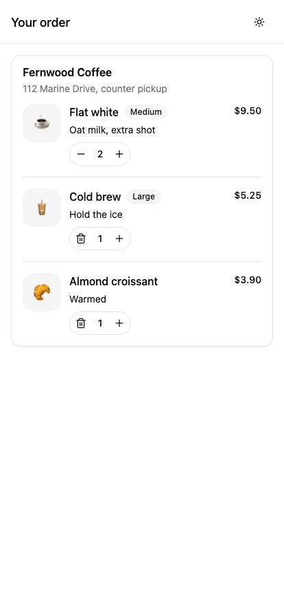
Tapping plus on the flat white should change its price from $9.50 to $14.25. Tapping the trash icon on an item with a quantity of one should remove the row. The minus button turns into a trash icon whenever the quantity is one.
Step 7: Build the Pickup Options
The pickup card brings together three controls: a Select, an Input, and a Switch. The input and switch are fairly straightforward. The Select needs a little more attention because it has three platform-related quirks, and two of them can fail silently.
Create components/cart/pickup-card.tsx:
import { Input } from '@/components/ui/input';
import { Label } from '@/components/ui/label';
import {
  Select,
  SelectContent,
  SelectItem,
  SelectTrigger,
  SelectValue,
} from '@/components/ui/select';
import { Switch } from '@/components/ui/switch';
import { Text } from '@/components/ui/text';
import { PICKUP_TIMES } from '@/lib/menu';
import { View } from 'react-native';
import { useSafeAreaInsets } from 'react-native-safe-area-context';

type PickupCardProps = {
  pickupValue: string;
  onPickupValueChange: (value: string) => void;
  name: string;
  onNameChange: (value: string) => void;
  ownCup: boolean;
  onOwnCupChange: (value: boolean) => void;
};

export function PickupCard({
  pickupValue,
  onPickupValueChange,
  name,
  onNameChange,
  ownCup,
  onOwnCupChange,
}: PickupCardProps) {
  const insets = useSafeAreaInsets();
  // Look the label up from our own data. The Option handed back by onValueChange
  // does not carry a usable label on web. See the note below.
  const selected = PICKUP_TIMES.find((time) => time.value === pickupValue);
  const contentInsets = {
    top: insets.top,
    bottom: insets.bottom,
    left: 16,
    right: 16,
  };

  return (
    <View className="gap-5">
      <View className="gap-2">
        <Label nativeID="pickup-time">Pickup time</Label>
        <Select
          value={selected}
          onValueChange={(option) => {
            if (option) {
              onPickupValueChange(option.value);
            }
          }}>
          <SelectTrigger className="w-full" aria-labelledby="pickup-time">
            <SelectValue placeholder="Pick a time" />
          </SelectTrigger>
          <SelectContent insets={contentInsets} className="w-full">
            {PICKUP_TIMES.map((time) => (
              <SelectItem key={time.value} value={time.value} label={time.label} />
            ))}
          </SelectContent>
        </Select>
      </View>

      <View className="gap-2">
        <Label nativeID="order-name">Name for the order</Label>
        <Input
          aria-labelledby="order-name"
          value={name}
          onChangeText={onNameChange}
          placeholder="Who is picking it up?"
          autoCapitalize="words"
          autoComplete="name"
          returnKeyType="done"
        />
      </View>

      <View className="flex-row items-center justify-between gap-4">
        <View className="flex-1 gap-1">
          <Label nativeID="own-cup" onPress={() => onOwnCupChange(!ownCup)}>
            Bringing my own cup
          </Label>
          <Text variant="muted">Takes 25¢ off and saves a lid.</Text>
        </View>
        <Switch nativeID="own-cup" checked={ownCup} onCheckedChange={onOwnCupChange} />
      </View>
    </View>
  );
}
Problem 1: Portals and the PortalHost
When a dropdown opens, it needs to appear above the other content on the screen. For that reason, SelectContent isn't rendered in the same place where you declare it in the component tree. It uses @rn-primitives/portal to render the content in another part of the app. This technique is called a portal.
On the web, a portal renders into document.body, and every page has one. React Native has nothing like that. So the portal package keeps a list of portal contents in memory, and a component called PortalHost reads that list and displays it. This is a simplified version of that code from node_modules/@rn-primitives/portal/dist/index.js:
var DEFAULT_PORTAL_HOST = "INTERNAL_PRIMITIVE_DEFAULT_HOST_NAME";
var updatePortal = (hostName, name, children) => { /* writes into the map */ };
function PortalHost({ name = DEFAULT_PORTAL_HOST }) { /* reads the map */ }
If no PortalHost is mounted, the content is saved but never displayed. The dropdown opens into nothing, and you get no error or warning.
The template already includes a PortalHost at the bottom of the root layout:
<ThemeProvider value={NAV_THEME[theme ?? 'light']}>
  <StatusBar style={theme === 'dark' ? 'light' : 'dark'} />
  <Stack />
  <PortalHost />
</ThemeProvider>
It looks like unnecessary code, but you need to keep it. The AlertDialog in Step 10 uses it too.
Problem 2: Safe Area Insets
There's another issue to consider when showing a dropdown on a phone. Parts of the screen are reserved for the operating system, such as the area around the notch and the home indicator. If a dropdown opens near the bottom of the screen, one of its options could appear underneath the home indicator. In that area, a tap may be handled by the operating system instead of your app.
To avoid this, pass the safe area insets to the content:
const insets = useSafeAreaInsets();
const contentInsets = { top: insets.top, bottom: insets.bottom, left: 16, right: 16 };

<SelectContent insets={contentInsets} className="w-full">
The insets prop is part of PositionedContentProps in @rn-primitives/types, so every positioned component in the registry accepts it, including Popover, DropdownMenu, HoverCard, Tooltip, and Select. It's a good habit to pass it every time.
Problem 3: The Select Value Is an Object
One more thing to watch out for is the value returned by onValueChange. It may look like you're selecting a string, but the callback returns an Option object:
type Option = { value: string; label: string } | undefined;
This causes a bug that only appears on one platform. If you store the whole Option in state and show option.label later, such as in a confirmation dialog, it displays correctly on a phone ("In 30 minutes") but incorrectly in the browser ("30").
The reason is in the primitive's source code. This is the native version, from select.js:
onValueChange({ value: itemValue, label });
And this is the web version, from select.web.js. It uses Radix, which only returns a value:
onValueChange({ value: val, label: val });
So the label is correct on native, but on the web it's a copy of the value. If you only test in a simulator, you won't notice this problem.
The fix is to keep only the value in state and look up the label from your own list:
const selected = PICKUP_TIMES.find((time) => time.value === pickupValue);
This is why PICKUP_TIMES is in lib/menu.ts. The pickup card needs it to build the options, and the main screen needs it to write the confirmation message.
Making the Label Tappable
The switch itself is quite small, so users may tap the label next to it instead. It makes sense to let that label toggle the switch as well. You can do that by adding an onPress handler to the Label:
<Label nativeID="own-cup" onPress={() => onOwnCupChange(!ownCup)}>
  Bringing my own cup
</Label>
<Switch nativeID="own-cup" checked={ownCup} onCheckedChange={onOwnCupChange} />
Giving both elements the same nativeID connects them for screen readers. The onPress on the Label is what makes the text toggle the switch, because React Native has no automatic <label for> behavior.
While you're here, open components/ui/switch.tsx. On the web, shadcn colors a switch with data-[state=checked]:bg-primary, which reads an attribute set in the DOM. React Native has no data-* attributes, so the component checks the prop in JavaScript:
props.checked ? 'bg-primary' : 'bg-input dark:bg-input/80',
The result is the same. Keep this in mind if you copy a data-[state=...] selector from a web example and it has no effect.
Keyboard Props for the Name Field
Input is a TextInput with your border and radius applied. You should set these four props on every text input:
autoCapitalize="words"capitalizes each word, which suits a name.autoComplete="name"lets the operating system offer to fill in the name.returnKeyType="done"changes the return key label to "Done".keyboardType="number-pad"shows a numeric keyboard when you need digits.
Together with automaticallyAdjustKeyboardInsets on the ScrollView from Step 5, this keeps the field visible while the keyboard is open. If you need more control, react-native-keyboard-controller is already a dependency of the template, and it provides KeyboardAwareScrollView and KeyboardProvider.
When you open the dropdown, it should appear right under the trigger at the same width, with a check mark next to the current value:
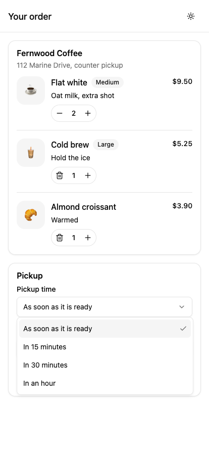
Try picking a time and check that the trigger updates. Tap the words "Bringing my own cup" and confirm the switch flips. Type in the name field and confirm the keyboard doesn't cover it. If the dropdown opens and shows nothing, check your PortalHost.
Step 8: Build the Bill Component
The bill component is pretty small, but there are two details you should pay particular attention to here, especially when the values change while someone is editing their order.
Create components/cart/bill.tsx:
import { Separator } from '@/components/ui/separator';
import { Text } from '@/components/ui/text';
import { cn } from '@/lib/utils';
import { money } from '@/lib/menu';
import { View } from 'react-native';

type BillProps = {
  subtotal: number;
  discount: number;
  tax: number;
  total: number;
};

function Line({ label, value, tone }: { label: string; value: number; tone?: 'muted' | 'credit' }) {
  return (
    <View className="flex-row items-center justify-between">
      <Text className={cn('text-sm', tone === 'muted' && 'text-muted-foreground')}>{label}</Text>
      <Text
        className={cn(
          'text-sm tabular-nums',
          tone === 'muted' && 'text-muted-foreground',
          tone === 'credit' && 'text-foreground'
        )}>
        {money(value)}
      </Text>
    </View>
  );
}

export function Bill({ subtotal, discount, tax, total }: BillProps) {
  return (
    <View className="gap-2">
      <Line label="Subtotal" value={subtotal} tone="muted" />
      {discount > 0 ? <Line label="Own cup" value={-discount} tone="credit" /> : null}
      <Line label="Tax" value={tax} tone="muted" />
      <Separator className="my-1" />
      <View className="flex-row items-center justify-between">
        <Text className="font-medium">Total</Text>
        <Text className="text-lg font-semibold tabular-nums">{money(total)}</Text>
      </View>
    </View>
  );
}
First, use tabular-nums on every number. Right-aligned prices in a proportional font don't line up at the decimal point, and using tabular-nums fixes that, as in the order rows.
Second, only show the discount row when it applies. The code uses {discount > 0 ? <Line /> : null} instead of {discount && <Line />}. In JSX, if the left side of && is the number 0, React renders the 0. In React Native, a bare number outside a Text component throws the error Text strings must be rendered within a <Text> component. Using a boolean check and returning null avoids this whole category of bugs.
To test it, turn on the own cup switch and scroll down. An Own cup line should appear with -$0.25, and the tax should change from $1.54 to $1.52, because tax is calculated on the discounted subtotal:
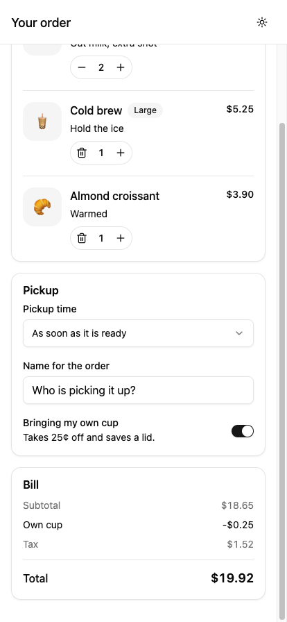
The total changes from $20.19 to $19.92, which is 27 cents lower instead of 25. The extra two cents come from the lower tax.
Step 9: Build the Fixed Checkout Bar
I want the total and checkout button to remain visible while the user scrolls through the cart. On the web, you might reach for position: sticky and bottom: 0. React Native doesn't work that way, but we can get the same result with a simple flex layout.
You can get the same result with Flexbox. This is the layout from Step 5 again:
<View className="bg-background flex-1">
  <ScrollView className="flex-1" ...>{/* content */}</ScrollView>
  <CheckoutBar ... />
</View>
The outer View is a column. The ScrollView has flex-1, so it takes all the leftover height. The checkout bar is a sibling placed after it, so it sits at the bottom and doesn't scroll. You don't need any positioning or z-index.
Handling the Home Indicator
On phones without a home button, the bottom 34 points or so belong to the system. A button drawn there is hard or impossible to press. To avoid this, add the bottom safe area inset as padding.
const insets = useSafeAreaInsets();

<View
  className="border-border bg-background flex-row items-center gap-4 border-t px-4 pt-3"
  style={{ paddingBottom: insets.bottom + 12 }}>
The bottom padding is an inline style instead of a class because its value depends on the device and is only known when the app runs. Using className and style on the same element is fine, and this is the case it's meant for.
On devices with no gesture bar, and in a browser tab, insets.bottom is 0, so the extra 12 keeps the bar from looking cramped.
Create the full component in components/cart/checkout-bar.tsx. It includes the confirmation dialog, which Step 10 explains.
import {
  AlertDialog,
  AlertDialogAction,
  AlertDialogCancel,
  AlertDialogContent,
  AlertDialogDescription,
  AlertDialogFooter,
  AlertDialogHeader,
  AlertDialogTitle,
  AlertDialogTrigger,
} from '@/components/ui/alert-dialog';
import { Button } from '@/components/ui/button';
import { Icon } from '@/components/ui/icon';
import { Text } from '@/components/ui/text';
import { money } from '@/lib/menu';
import * as Haptics from 'expo-haptics';
import { ArrowRightIcon } from 'lucide-react-native';
import { View } from 'react-native';
import { useSafeAreaInsets } from 'react-native-safe-area-context';

type CheckoutBarProps = {
  total: number;
  itemCount: number;
  pickupLabel: string;
  name: string;
  onConfirm: () => void;
};

export function CheckoutBar({ total, itemCount, pickupLabel, name, onConfirm }: CheckoutBarProps) {
  const insets = useSafeAreaInsets();
  const empty = itemCount === 0;

  function confirm() {
    // expo-haptics ships a web implementation that falls back to navigator.vibrate,
    // so this needs no platform guard.
    Haptics.notificationAsync(Haptics.NotificationFeedbackType.Success);
    onConfirm();
  }

  return (
    <View
      className="border-border bg-background flex-row items-center gap-4 border-t px-4 pt-3"
      style={{ paddingBottom: insets.bottom + 12 }}>
      <View className="flex-1">
        <Text variant="muted" className="text-xs">
          {empty ? 'Nothing in the cart' : `${itemCount} ${itemCount === 1 ? 'item' : 'items'}`}
        </Text>
        <Text className="text-xl font-semibold tabular-nums">{money(total)}</Text>
      </View>

      <AlertDialog>
        <AlertDialogTrigger asChild>
          <Button size="lg" disabled={empty}>
            <Text>Place order</Text>
            <Icon as={ArrowRightIcon} />
          </Button>
        </AlertDialogTrigger>
        <AlertDialogContent>
          <AlertDialogHeader>
            <AlertDialogTitle>Send this to the counter?</AlertDialogTitle>
            <AlertDialogDescription>
              {`${money(total)} for ${name.trim() || 'pickup'}, ${pickupLabel.toLowerCase()}. We start making it right away, so it cannot be cancelled after this.`}
            </AlertDialogDescription>
          </AlertDialogHeader>
          <AlertDialogFooter>
            <AlertDialogCancel>
              <Text>Not yet</Text>
            </AlertDialogCancel>
            <AlertDialogAction onPress={confirm}>
              <Text>Send it</Text>
            </AlertDialogAction>
          </AlertDialogFooter>
        </AlertDialogContent>
      </AlertDialog>
    </View>
  );
}
A Note on Thin Borders
border-t draws a line that's one logical point thick, which is two or three physical pixels on most modern screens. Next to a true one-pixel line, it looks heavy. React Native's StyleSheet.hairlineWidth gives you the thinnest line the screen can draw, and the template connects it to Tailwind with this line in global.css:
--spacing-hairline: hairlineWidth();
This adds hairline to Tailwind's spacing scale, so h-hairline gives you a divider that's one physical pixel tall. The Common Mistakes section later explains one catch when you try to use it as an override.
That's the checkout bar in place. Scroll to the bottom of the screen and check that it stays below the bill:
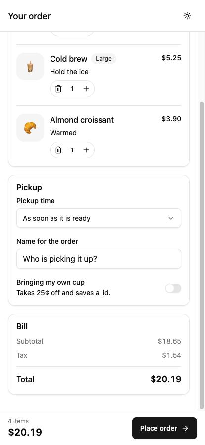
Scroll back to the top and the bar stays in the same place:
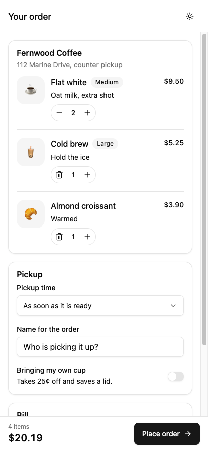
On a phone with a notch, the button should be above the gesture bar. If you remove all items with the trash buttons, the button should be disabled and the label should say "Nothing in the cart".
Step 10: Add the Confirmation and Put the Screen Together
The checkout bar already contains the confirmation dialog. Before putting the full screen together, there are two differences between the React Native implementation and the web version that are worth looking at.
1. It Also Needs the PortalHost
On iOS, it also wraps itself in FullWindowOverlay from react-native-screens, so it draws above the native navigation header instead of under it. This is handled inside alert-dialog.tsx, which is why that file imports something that looks unrelated.
2. The Footer Reverses its Order on Phones
AlertDialogFooter uses flex-col-reverse and only becomes a row at the sm: breakpoint. On a phone, the button you write last is shown on top. Writing Cancel first and Action second puts the confirm button where the thumb is and the cancel button below it.
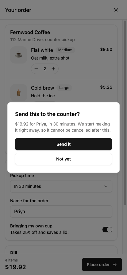
Haptics
When the customer confirms the order, the confirm function calls Haptics.notificationAsync(Haptics.NotificationFeedbackType.Success). This gives a short success vibration on supported devices.
You might expect to wrap this call in a platform check because browsers don't have the same haptics support as native apps. In this case, expo-haptics already includes a web implementation that uses navigator.vibrate, with a fallback for iOS Safari. If the browser can't provide haptics, the call simply does nothing, so we don't need an extra platform check.
notificationAsync is meant for outcomes such as success or failure. impactAsync is for physical collisions, and selectionAsync is for moving through a list of options. Using the wrong one won't cause an error, but it feels slightly off.
The Full Screen
Now we can bring everything together in the main screen. This is where we'll keep the state, calculate the bill using billFor, and pass the required values and callbacks to each component.
When an order is placed, it sets orderNumber, and the screen shows a confirmation instead. Inside that confirmation, <Stack.Screen options> changes the header title to "Order sent" without navigating anywhere, so the whole flow stays in one file and one route.
Replace app/index.tsx with:
import { Bill } from '@/components/cart/bill';
import { CheckoutBar } from '@/components/cart/checkout-bar';
import { OrderRow } from '@/components/cart/order-row';
import { PickupCard } from '@/components/cart/pickup-card';
import { Button } from '@/components/ui/button';
import { Card, CardContent, CardDescription, CardHeader, CardTitle } from '@/components/ui/card';
import { Icon } from '@/components/ui/icon';
import { Separator } from '@/components/ui/separator';
import { Text } from '@/components/ui/text';
import { billFor, INITIAL_CART, PICKUP_TIMES, type CartItem } from '@/lib/menu';
import { Stack } from 'expo-router';
import { CircleCheckIcon, MoonStarIcon, SunIcon } from 'lucide-react-native';
import * as React from 'react';
import { ScrollView, View } from 'react-native';
import { Uniwind, useUniwind } from 'uniwind';

const SCREEN_OPTIONS = {
  title: 'Your order',
  headerRight: () => <ThemeToggle />,
};

export default function CartScreen() {
  const [items, setItems] = React.useState<CartItem[]>(INITIAL_CART);
  const [pickupValue, setPickupValue] = React.useState(PICKUP_TIMES[0].value);
  const [name, setName] = React.useState('');
  const [ownCup, setOwnCup] = React.useState(false);
  const [orderNumber, setOrderNumber] = React.useState<string | null>(null);

  const bill = billFor(items, ownCup);
  const itemCount = items.reduce((count, item) => count + item.qty, 0);
  const pickupLabel =
    PICKUP_TIMES.find((time) => time.value === pickupValue)?.label ?? PICKUP_TIMES[0].label;

  function changeQty(id: string, qty: number) {
    setItems((current) =>
      qty <= 0
        ? current.filter((item) => item.id !== id)
        : current.map((item) => (item.id === id ? { ...item, qty } : item))
    );
  }

  function placeOrder() {
    setOrderNumber(`A-${Math.floor(Math.random() * 90 + 10)}`);
  }

  function startOver() {
    setItems(INITIAL_CART);
    setOwnCup(false);
    setName('');
    setPickupValue(PICKUP_TIMES[0].value);
    setOrderNumber(null);
  }

  if (orderNumber) {
    return (
      <>
        <Stack.Screen options={{ ...SCREEN_OPTIONS, title: 'Order sent' }} />
        <View className="bg-background flex-1 items-center justify-center gap-6 p-8">
          <Icon as={CircleCheckIcon} className="text-primary size-16" />
          <View className="gap-2">
            <Text variant="h3" className="text-center">
              We are on it
            </Text>
            <Text variant="muted" className="text-center">
              {`Order ${orderNumber} for ${name.trim() || 'pickup'}. Come to the far end of the counter and look for your name on the cup.`}
            </Text>
          </View>
          <Button variant="outline" onPress={startOver}>
            <Text>Start another order</Text>
          </Button>
        </View>
      </>
    );
  }

  return (
    <>
      <Stack.Screen options={SCREEN_OPTIONS} />
      <View className="bg-background flex-1">
        <ScrollView
          className="flex-1"
          contentContainerClassName="gap-4 p-4 pb-8"
          keyboardShouldPersistTaps="handled"
          automaticallyAdjustKeyboardInsets>
          <Card className="gap-3 py-4">
            <CardHeader className="px-4">
              <CardTitle>Fernwood Coffee</CardTitle>
              <CardDescription>112 Marine Drive, counter pickup</CardDescription>
            </CardHeader>
            <CardContent className="gap-4 px-4">
              {items.length === 0 ? (
                <Text variant="muted">Your cart is empty. Add something warm.</Text>
              ) : null}
              {items.map((item, index) => (
                <React.Fragment key={item.id}>
                  {index > 0 ? <Separator /> : null}
                  <OrderRow item={item} onChangeQty={changeQty} />
                </React.Fragment>
              ))}
            </CardContent>
          </Card>

          <Card className="gap-3 py-4">
            <CardHeader className="px-4">
              <CardTitle>Pickup</CardTitle>
            </CardHeader>
            <CardContent className="px-4">
              <PickupCard
                pickupValue={pickupValue}
                onPickupValueChange={setPickupValue}
                name={name}
                onNameChange={setName}
                ownCup={ownCup}
                onOwnCupChange={setOwnCup}
              />
            </CardContent>
          </Card>

          <Card className="gap-3 py-4">
            <CardHeader className="px-4">
              <CardTitle>Bill</CardTitle>
            </CardHeader>
            <CardContent className="px-4">
              <Bill {...bill} />
            </CardContent>
          </Card>
        </ScrollView>

        <CheckoutBar
          total={bill.total}
          itemCount={itemCount}
          pickupLabel={pickupLabel}
          name={name}
          onConfirm={placeOrder}
        />
      </View>
    </>
  );
}

const THEME_ICONS = {
  light: SunIcon,
  dark: MoonStarIcon,
};

function ThemeToggle() {
  const { theme } = useUniwind();

  return (
    <Button
      onPressIn={() => Uniwind.setTheme(theme === 'dark' ? 'light' : 'dark')}
      size="icon"
      variant="ghost"
      className="ios:size-9 web:mx-4 rounded-full"
      accessibilityLabel="Switch theme">
      <Icon as={THEME_ICONS[theme ?? 'light']} className="size-5" />
    </Button>
  );
}
Notice that pickupLabel is the fix from Step 7 in use. The screen looks up the label from PICKUP_TIMES and passes a plain string to CheckoutBar, so CheckoutBar never touches an Option object or the incorrect web label.
To test it, place an order. The dialog should show your name and the pickup time you chose (such as "in 30 minutes"), not the raw value 30. Confirm the order, and you should see the confirmation screen:
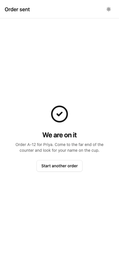
Tap "Start another order" and the cart returns to its original state.
The checkout screen is now working, and each part is kept in its own component. You can use the same approach when you build other screens: keep the component focused, pass the data it needs through props, and let the shared theme handle the styling.
Step 11: Add Dark Mode
We already added the theme toggle in Step 10. Here's the component again so we can look at how it switches between light and dark mode:
import { Uniwind, useUniwind } from 'uniwind';

function ThemeToggle() {
  const { theme } = useUniwind();

  return (
    <Button
      onPressIn={() => Uniwind.setTheme(theme === 'dark' ? 'light' : 'dark')}
      size="icon"
      variant="ghost"
      className="ios:size-9 web:mx-4 rounded-full"
      accessibilityLabel="Switch theme">
      <Icon as={THEME_ICONS[theme ?? 'light']} className="size-5" />
    </Button>
  );
}
Uniwind.setTheme changes the values behind every token, so everything that uses bg-card, text-muted-foreground, and similar classes updates at once. useUniwind subscribes the component to the current theme, so the icon changes too.
This code also uses the ios: and web: prefixes. Uniwind supports platform variants, so web:mx-4 only adds margin in the browser, and ios:size-9 only applies on iOS. It's similar to Platform.select, but it stays inside the class string.
Three things aren't handled by setTheme, and if you forget them, you end up with a screen that's only partly dark. The template already sets up the first two.
1. The Navigation Header
React Navigation takes its colors from a plain object, so the root layout needs to pass it the right one:
const { theme } = useUniwind();

<ThemeProvider value={NAV_THEME[theme ?? 'light']}>
2. The Status Bar
The clock and battery icons are drawn by the operating system, so you need to tell it which style to use. Without this, you can get dark text on a dark bar.
<StatusBar style={theme === 'dark' ? 'light' : 'dark'} />
3. Saving the Choice
Uniwind.setTheme only applies to the current session. The next time the app starts, it follows the system setting again. To keep the user's choice, save it with expo-secure-store or AsyncStorage and call setTheme when the app starts. You can call setTheme('system') to go back to following the operating system.
When you tap the header icon, the cards, borders, inputs, switch, header, and status bar should all change together. You can explore more ready-made shadcn blocks if you want examples of how these components are used in larger interfaces:
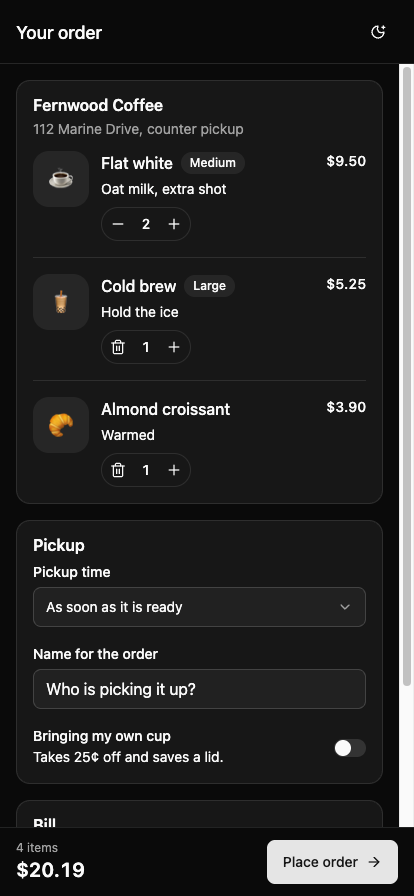
Look for anything that stays light while the rest goes dark. A light header usually means the ThemeProvider is not receiving the new NAV_THEME.
Step 12: Create Your Own Theme
The screen is currently using the default gray theme. Let's change it to a coffee-inspired palette with warm cream backgrounds and brown accents. This will also help us see why the palette needs to be updated in both global.css and lib/theme.ts.
Update the Tokens
Replace the @layer theme block in global.css with this coffee palette:
@layer theme {
  :root {
    @variant light {
      --color-background: oklch(0.98 0.008 75);
      --color-foreground: oklch(0.24 0.02 60);
      --color-card: oklch(1 0.003 90);
      --color-card-foreground: oklch(0.24 0.02 60);
      --color-popover: oklch(1 0.003 90);
      --color-popover-foreground: oklch(0.24 0.02 60);
      --color-primary: oklch(0.44 0.06 45);
      --color-primary-foreground: oklch(0.99 0.01 85);
      --color-secondary: oklch(0.93 0.03 80);
      --color-secondary-foreground: oklch(0.35 0.05 45);
      --color-muted: oklch(0.95 0.012 80);
      --color-muted-foreground: oklch(0.52 0.02 60);
      --color-accent: oklch(0.92 0.04 78);
      --color-accent-foreground: oklch(0.32 0.05 45);
      --color-destructive: oklch(0.577 0.245 27.325);
      --color-border: oklch(0.89 0.02 75);
      --color-input: oklch(0.89 0.02 75);
      --color-ring: oklch(0.44 0.06 45);
    }

    @variant dark {
      --color-background: oklch(0.17 0.012 60);
      --color-foreground: oklch(0.96 0.008 85);
      --color-card: oklch(0.22 0.016 62);
      --color-card-foreground: oklch(0.96 0.008 85);
      --color-popover: oklch(0.22 0.016 62);
      --color-popover-foreground: oklch(0.96 0.008 85);
      --color-primary: oklch(0.85 0.09 75);
      --color-primary-foreground: oklch(0.22 0.03 55);
      --color-secondary: oklch(0.29 0.022 62);
      --color-secondary-foreground: oklch(0.94 0.01 85);
      --color-muted: oklch(0.27 0.018 62);
      --color-muted-foreground: oklch(0.72 0.015 75);
      --color-accent: oklch(0.31 0.03 65);
      --color-accent-foreground: oklch(0.95 0.01 85);
      --color-destructive: oklch(0.704 0.191 22.216);
      --color-border: oklch(1 0 0 / 12%);
      --color-input: oklch(1 0 0 / 15%);
      --color-ring: oklch(0.85 0.09 75);
    }
  }
}
If you don't want to choose thirty colors by hand, you can generate a theme with the shadcn theme generator or tweakcn. Both export CSS variables, but you need to make two changes before the output works in this project:
- Rename each variable to include the
--color-prefix. For example,--primarybecomes--color-primary. - Move the
:rootblock inside@variant light, and the.darkblock inside@variant dark.
Also remove --radius from what you paste, because the template already defines it along with the derived sizes. Remove any --shadow-* variables too, since nothing in the registry reads them.
Update lib/theme.ts
After you save and reload, the result looks like this:
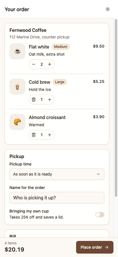
The page is cream, the button is brown, and the badges have the right color, but the header is still white with a visible line under it. The reason is that React Navigation draws the header using lib/theme.ts, and that file still has the old palette. Nothing is broken and nothing warns you, so this mistake is easy to miss. If you're designing the same interface in Figma, the shadcn Figma resources can also help you keep the design and implementation aligned.
Update lib/theme.ts to match:
import { DarkTheme, DefaultTheme, type Theme } from 'expo-router/react-navigation';

export const THEME = {
  light: {
    background: '#fcf8f3',
    foreground: '#261d16',
    card: '#fffffd',
    primary: '#6e4836',
    border: '#e3d9cd',
    destructive: '#e7000b',
    /* the rest of the list */
  },
  dark: {
    background: '#130e0a',
    foreground: '#f4f1ec',
    card: '#201913',
    primary: '#f1c68b',
    border: '#3a3129',
    destructive: '#ff6467',
    /* the rest of the list */
  },
};

export const NAV_THEME: Record<'light' | 'dark', Theme> = {
  light: {
    ...DefaultTheme,
    colors: {
      background: THEME.light.background,
      border: THEME.light.border,
      card: THEME.light.background,
      notification: THEME.light.destructive,
      primary: THEME.light.primary,
      text: THEME.light.foreground,
    },
  },
  dark: {
    ...DarkTheme,
    colors: {
      background: THEME.dark.background,
      border: THEME.dark.border,
      card: THEME.dark.background,
      notification: THEME.dark.destructive,
      primary: THEME.dark.primary,
      text: THEME.dark.foreground,
    },
  },
};
This isn't a direct copy of global.css, so three points need explanation:
- Use hex colors instead of
oklch(): Uniwind convertsoklch()for your classes, but React Navigation does not, so give it a format that React Native can read directly. You can convert a color with any online converter, or paste theoklch()value into your browser's developer tools color picker and read the hex value. - Map React Navigation's
cardto yourbackground, not yourcard. The two names look the same but mean different things. In shadcn,cardis a raised surface on top of the page. In React Navigation,cardis the background of the screen and header. If you map them by name, the header ends up a shade lighter than the page. You won't notice this with the stock template because it uses the same value forcardandbackground. It only shows up once you create a theme where cards stand out from the page, like this one. - Use a solid color in place of a transparent border. In dark mode,
--color-borderisoklch(1 0 0 / 12%), which is white at 12% opacity. A navigation theme needs a solid color, so work out what that border looks like on your background and use that value.
After this change, the header and page match in both light and dark mode, and you didn't edit any component files:
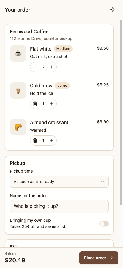
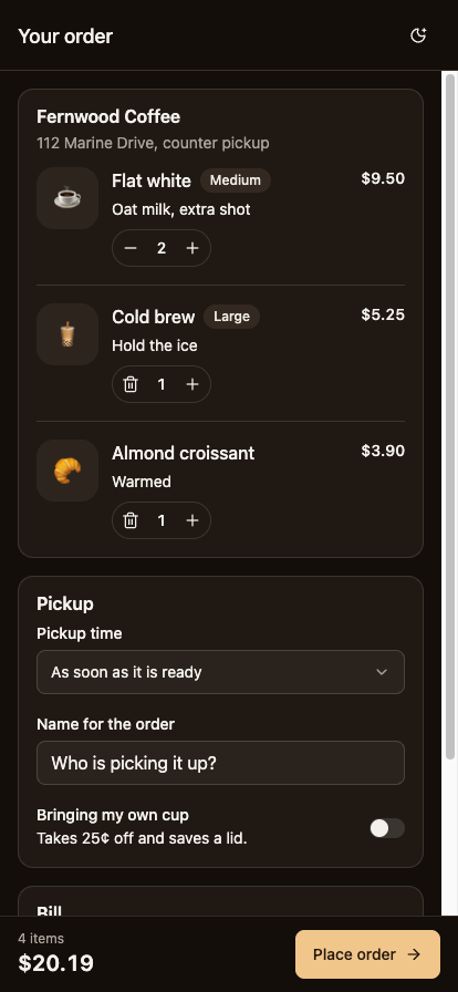
Switch between light and dark a few times and watch the header. If it's a shade lighter or darker than the page, one of the values in lib/theme.ts is still from the old palette.
Common Mistakes and How to Fix Them
If you're coming from web development, some of these differences may catch you off guard. I've collected the issues covered in the tutorial in the table below, along with the fix for each one. You can refer back to it when something doesn't behave as expected.
| What you do | What happens | The fix |
|---|---|---|
<Badge>Medium</Badge> |
Red screen: "Text strings must be rendered within a <Text>." |
Wrap the text: <Badge><Text>Medium</Text></Badge>. The same applies to Button. |
{count && <Line/>} when count is 0 |
The same error, caused by a stray 0 |
{count > 0 ? <Line/> : null} |
space-y-3 on a column |
Nothing happens and there is no warning | Use gap-3 on the parent |
className="p-4" on a ScrollView |
Padding is clipped and gaps are ignored | Use contentContainerClassName |
truncate on a long name |
The text isn't truncated and the price is pushed off screen | Use numberOfLines={1} |
Using flex and expecting a row |
Items stack vertically | React Native defaults to a column, so add flex-row |
hover:bg-accent |
Nothing happens on a device | Use active: for the pressed state |
Deleting PortalHost from the layout |
Dropdowns open into nothing, with no error | Put it back |
| A Select near the bottom of the screen | The last option is under the home indicator | Pass insets to SelectContent |
Showing option.label from onValueChange |
Correct on native, but the raw value on the web | Look up the label from your own data |
A bottom bar with only p-4 |
The button is under the gesture bar | Use paddingBottom: insets.bottom + 12 in style |
| 28-point stepper buttons | Hard to tap with a thumb | Add hitSlop={8} |
Changing only global.css for a new theme |
The header keeps the old colors | Update lib/theme.ts too |
<Avatar> without alt |
TypeScript won't compile | alt is required, and it becomes the accessibility label |
rounded-2xl on Avatar only |
A circular fallback inside rounded corners | Repeat it on AvatarFallback |
Guarding haptics with Platform.OS !== 'web' |
A working web fallback is removed | expo-haptics already handles the web |
| Right-aligned prices in a normal font | Digits shift whenever the number changes | Use tabular-nums, which also works on native |
<Separator className="h-hairline" /> |
Both height classes are kept | See below |
The last row needs more explanation, because it looks like a bug in cn(), but it's not.
cn() uses tailwind-merge, which resolves conflicts between classes. It knows the default Tailwind scale, but it doesn't know about custom values you declare in global.css. The value hairline comes from --spacing-hairline: hairlineWidth(), so tailwind-merge can't tell that h-hairline and h-[1px] set the same property, and it keeps both:
cn('h-[1px] w-full', 'h-hairline my-1')  // 'h-[1px] w-full h-hairline my-1'
cn('h-[1px] w-full', 'h-2 my-1')         // 'w-full h-2 my-1'
The second result is correct. In the first, which height wins depends on the order of the CSS. The other overrides in this tutorial, such as size-14 over size-8, work correctly because those are names tailwind-merge recognizes. If you want it to understand your custom scale, you can teach it with extendTailwindMerge in lib/utils.ts. Otherwise, use an arbitrary value, or edit the component file directly, since you own it.
There's a related case in the stepper buttons. They pass size-7 to a Button whose icon size is h-10 w-10 sm:h-9 sm:w-9:
cn('h-10 w-10 sm:h-9 sm:w-9', 'size-7 rounded-full')
// 'sm:h-9 sm:w-9 size-7 rounded-full'
size-7 replaces the base h-10 w-10, but the two sm: classes stay, because tailwind-merge treats a responsive variant as a different class. On a phone this makes no difference, since sm: starts at 640px and phones are narrower than that. In a desktop browser, though, those buttons grow to 36 points.
Conclusion
In this tutorial, we built a coffee shop cart and checkout screen with React Native Reusables, Expo, and Uniwind. We added the order rows, pickup options, bill summary, fixed checkout bar, and confirmation dialog. We also looked at how the registry and CLI add component source code to the project and how the theme tokens control the app's colors.
One thing worth getting into the habit of is checking the component source when something doesn't behave the way you expect. Since the components live in your project, you can open them and see how they work. That's how we understood the difference in the Select label between web and native. It also makes customization easier because you can see which part of the component needs to change instead of adding more workarounds around it.
You can find the complete project in the GitHub repository. If you run into an issue or want to compare your code with the finished screen, clone the repository and check the implementation. If you're looking for more complete starting points for your next project, take a look at shadcn templates.
I captured the screenshots using the React Native Web build at a phone-sized viewport. The same project also runs on iOS and Android. I've called out the platform differences in the relevant sections, including the Select label and portal host in Step 7, safe area handling in Step 9, and haptics in Step 10.
Resources
React Native Reusables
- reactnativereusables.com: documentation and the registry
- Introduction: the list of differences from web shadcn
- CLI reference: the
init,add, anddoctorcommands - Create your own registry: publish components your team can add with the CLI
- The repository: MIT licensed
- Any registry entry is a public URL:
reactnativereusables.com/r/uniwind/<name>.jsonor.../r/nativewind/<name>.json
Tools used
APIs used


