
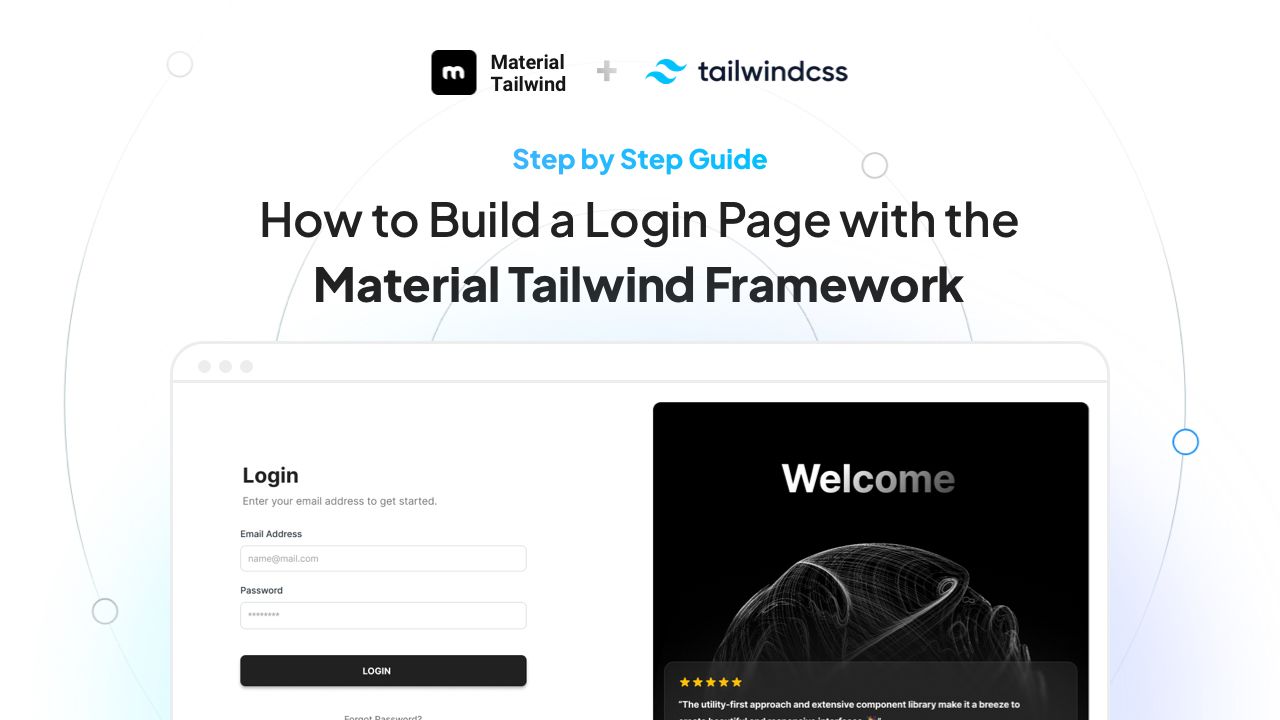
Login pages are like the front doors to our web apps. They should be inviting, easy to use, and safe. If you're looking to create one that combines both style and function, you're in the right place.
In this guide, we'll explore how to build a login page with Material Tailwind and Tailwind CSS that not only looks great but also works seamlessly across devices.
Whether you're new to web design or just curious about these tools, we'll walk you through each step. Let's dive in and start building!
Happy coding 🤘🏼
Table of Contents
Check out the article chapters:
- Introduction to Tailwind CSS and Material Tailwind
- How to Set Up Your Development Environment
- How to Install Necessary Dependencies for your Login Page
- How to Design the Layout with Tailwind CSS
- How to Integrate Material Tailwind Components
- How to Style Input Fields and Buttons
- How to Implement Responsive Design
- How to Add Interactivity and Validation
- Security and Best Practices for Login Pages
- Conclusions
1. Introduction to Tailwind CSS and Material Tailwind
Web design has many tools to help make good-looking and easy-to-use websites.
Two useful tools are Tailwind CSS and Material Tailwind. Tailwind CSS helps web designers make websites quickly without writing a lot of extra code. Material Tailwind adds nice-looking designs that are easy to change. Together, they can help you make a Tailwind CSS login page that looks good and works well.
In this section, you can see more details about these tools and why they're useful.
What is Tailwind CSS?
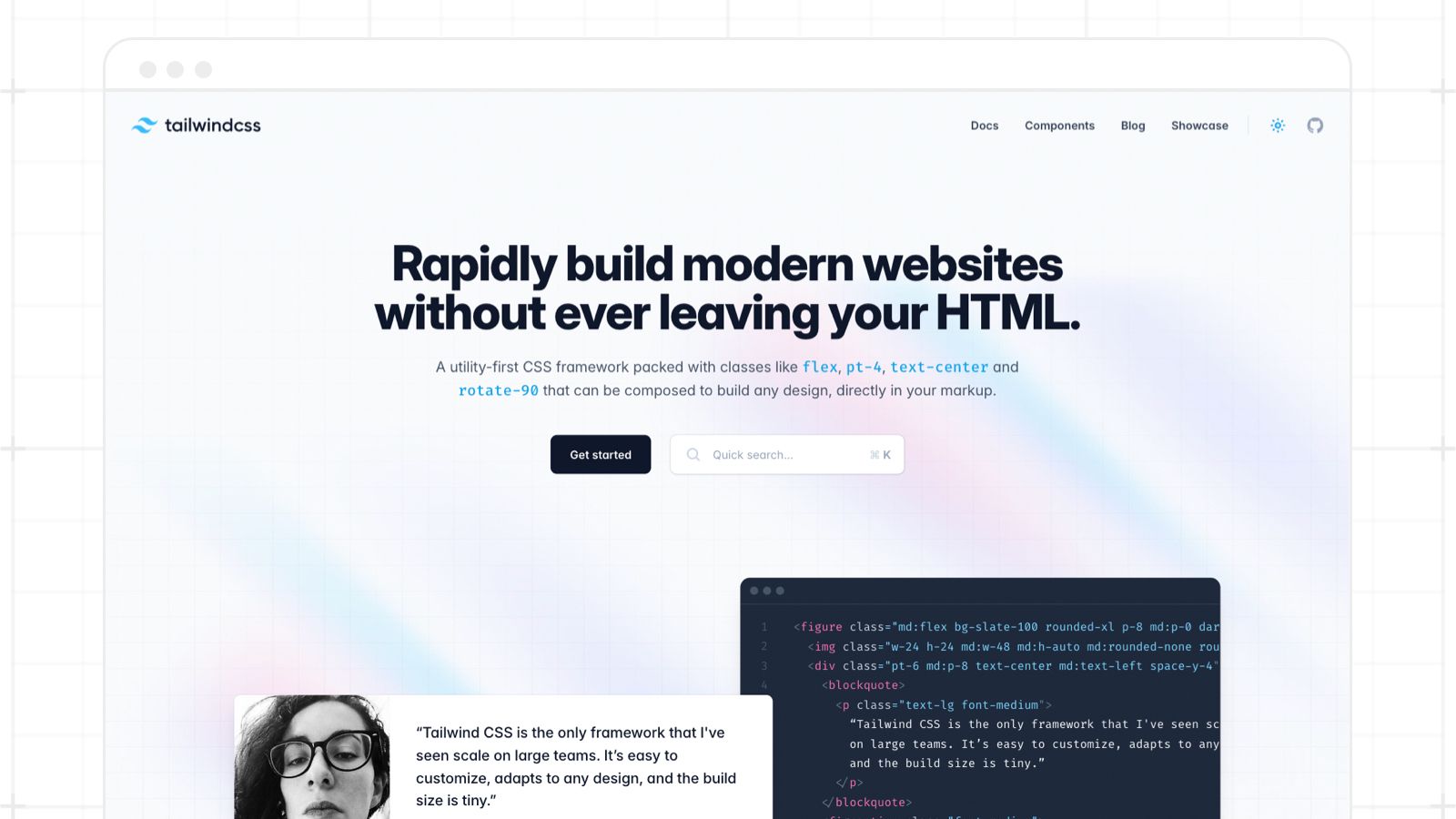
Tailwind is a utility-first CSS framework. Instead of pre-designed components, it provides low-level utility classes that let you build custom designs without leaving your HTML.
Since its launch, Tailwind CSS has taken the web development community by storm. By 2023, the framework had gained over 400 million downloads on Github, a proof of its growing adoption among developers. Several popular companies and platforms also started adopting Tailwind, for example: Vercel, Algolia, Netlify, and others. The Github statistics show over 74,000 stars, which indicates a strong community backing.
Why use Tailwind CSS:
- Speed: Quickly build UIs with utility classes instead of writing custom CSS.
- Flexibility: You can customize designs without restrictions.
- Responsiveness: Easily make designs that work on all device sizes.
Example: Instead of writing custom CSS for a button, use utility classes directly in your HTML.
<button class="bg-blue-500 hover:bg-blue-700 text-white font-bold py-2 px-4 rounded">
   View More
</button>
What is Material Tailwind?
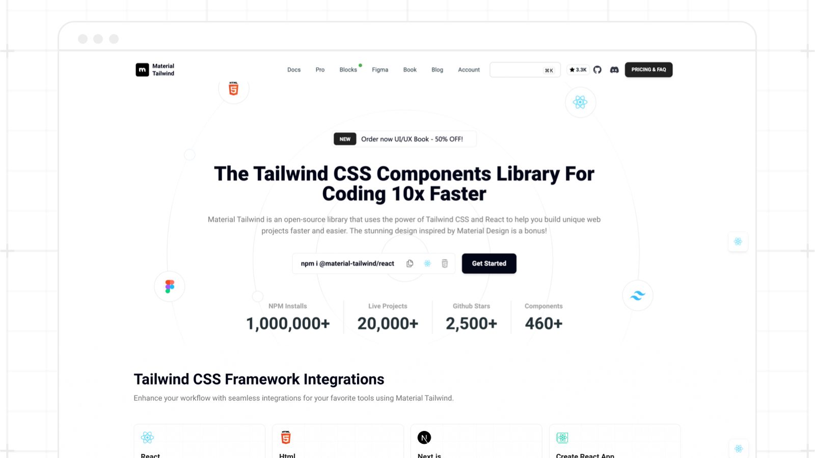
Material Tailwind is a components library for Tailwind CSS that implements Google's Material Design guidelines. It combines the best of both worlds: the utility-first approach of Tailwind and the design philosophy of Material Design.
Why use Material Tailwind:
- Consistency: Follows Material Design guidelines, ensuring familiar UI/UX patterns.
- Customizable: Being built on Tailwind, it's highly customizable.
- Component-rich: Comes with pre-built components that speed up development.
Example: Imagine you want a Material Design inspired button. With Material Tailwind, it's straightforward.
<button
  class="middle none center rounded-lg bg-pink-500 py-3 px-6 font-sans text-xs font-bold uppercase text-white shadow-md shadow-pink-500/20 transition-all hover:shadow-lg hover:shadow-pink-500/40 focus:opacity-[0.85] focus:shadow-none active:opacity-[0.85] active:shadow-none disabled:pointer-events-none disabled:opacity-50 disabled:shadow-none"
  data-ripple-light="true"
>
  View More
</button>
If you are a React fan too, let me tell you that Material Tailwind also comes with Tailwind CSS + React components. For more details, check out the Material Tailwind React documentation.
Now let’s see how you can use these two amazing tools to create your desired Login Page.
2. How to Set Up Your Development Environment
Creating a development environment tailored for your web project ensures smooth and efficient workflow. For our Tailwind CSS login page, we’ll start from scratch.
Prerequisites:
- Node.js and npm (Node Package Manager): These are essential for installing and managing libraries we’ll be using.
- A Text Editor or IDE: While any text editor will work, Visual Studio Code (VS Code) is recommended due to its extensive library of extensions beneficial for web development.
- Terminal or Command Prompt: We'll be running commands to set up and manage our project.
Install Node.js and npm
To start, visit the Node.js official website and download the recommended version for your OS.
After installation, verify that Node.js and npm are correctly installed by running the following commands:
node -v
npm -v
Set up a new project
Create a new directory for your project:
mkdir tailwind-material-login
cd tailwind-material-login
Then initialize a new npm project:
npm init -y
Text Editor/IDE Setup (VS Code)
If you haven’t already, download and install VS Code. Then go ahead and open your project directory in VS Code.
Optionally, you can install extensions that enhance Tailwind CSS development:
- Tailwind CSS IntelliSense: Offers class name autocompletions, linting, and more.
- Live Server: Allows you to see live changes without manually refreshing the browser.
Terminal in VS Code
VS Code offers an integrated terminal. This means you can run commands directly within your editor.
To open it, go to the top menu: View > Terminal or press Ctrl + a backtick.
Basic Project Structure
Create a basic structure for your project:
mkdir src
touch src/index.html
touch src/styles.css
touch src/main.js
This creates a src directory with an HTML file, a CSS file, and a JavaScript file.
3. How to Install Necessary Dependencies for your Login Page
Setting up your libraries and frameworks is crucial to build upon a solid foundation. For our Tailwind CSS login page, we'll be primarily using Tailwind CSS and Material Tailwind.
Here’s a step-by-step guide to installing and configuring these dependencies.
How to install Tailwind CSS
First, you'll need to install the Tailwind CSS package. Using npm, install the Tailwind CSS package with:
npm install tailwindcss
Then, integrate Tailwind into your CSS. Inside your src/styles.css file, add the following Tailwind directives:
@import 'tailwindcss/base';
@import 'tailwindcss/components';
@import 'tailwindcss/utilities';
Next, you'll need to generate a configuration file. While Tailwind works out of the box, a configuration file (tailwind.config.js) provides customization capabilities.
To generate it:
npx tailwindcss init
This creates a minimal config file in your root directory. You can extend this file as needed.
Finally, to process your CSS and apply Tailwind’s transformations, add a script in your package.json under the "scripts" section:
"scripts": {
"build-css": "tailwind build src/styles.css -o src/output.css"
}
Run the script with:
npm run build-css
This will generate an output.css containing all Tailwind's styles. Include this file in your HTML.
How to install Material Tailwind
First, install the Material Tailwind package. Again, you can use npm:
npm i @material-tailwind/html
Now you need to integrate it into your project. Material Tailwind provides components with styles applied. You can use them directly in your HTML or customize them further in your CSS.
For instance, to use a Material Tailwind button:
<button
  class="middle none center rounded-lg bg-pink-500 py-3 px-6 font-sans text-xs font-bold uppercase text-white shadow-md shadow-pink-500/20 transition-all hover:shadow-lg hover:shadow-pink-500/40 focus:opacity-[0.85] focus:shadow-none active:opacity-[0.85] active:shadow-none disabled:pointer-events-none disabled:opacity-50 disabled:shadow-none"
  data-ripple-light="true"
>
  View More
</button>
Next, install the required fonts and icons. Material Design recommends specific fonts and icons. Include these in your src/index.html:
<!-- Material Icons Link -->
<link href="https://fonts.googleapis.com/icon?family=Material+Icons" rel="stylesheet"/>

<!-- Font Awesome Link -->
<link rel="stylesheet" href="https://cdnjs.cloudflare.com/ajax/libs/font-awesome/5.15.2/css/all.min.css" integrity="sha512-HK5fgLBL+xu6dm/Ii3z4xhlSUyZgTT9tuc/hSrtw6uzJOvgRr2a9jyxxT1ely+B+xFAmJKVSTbpM/CuL7qxO8w==" crossorigin="anonymous"/>
PostCSS and Autoprefixer (Recommended)
Install PostCSS and Autoprefixer:
npm install postcss postcss-cli autoprefixer
Go ahead and configure them by creating a postcss.config.js in your root directory:
module.exports = {
  plugins: [
    require('tailwindcss'),
    require('autoprefixer'),
  ]
};
Modify your build-css script in package.json to:
"build-css": "postcss src/styles.css -o src/output.css"
This ensures your Tailwind CSS styles are vendor-prefixed, making them compatible across different browsers.
Add into your project’s <head> the output.css styling file.
<link rel="stylesheet" href="pathTo/output.css" />
4. How to Design the Login Page Layout with Tailwind CSS
A login page typically consists of a logo or branding, input fields (like username and password), a submit button, and often some secondary options or links, such as "Forgot Password" or "Sign Up".
Main Container:
Start with a main container that centers its content both vertically and horizontally.
<div class="min-h-screen flex items-center justify-center bg-gray-100">
<!-- Login Card Content Will Go Here -->
</div>
Login Card:
Create a centered card layout that will house the login form. Introduce the necessary input fields for the login process, typically an email/username and password.
<div class="relative flex flex-col text-gray-700 bg-white shadow-md w-96 rounded-xl bg-clip-border">
  <div
    class="relative grid mx-4 mb-4 -mt-6 overflow-hidden text-white shadow-lg h-28 place-items-center rounded-xl bg-gradient-to-tr from-gray-900 to-gray-800 bg-clip-border shadow-gray-900/20">
    <h3 class="block font-sans text-3xl antialiased font-semibold leading-snug tracking-normal text-white">
      Sign In
    </h3>
  </div>
  <div class="flex flex-col gap-4 p-6">
    <div class="relative h-11 w-full min-w-[200px]">
      <input
        class="w-full h-full px-3 py-3 font-sans text-sm font-normal transition-all bg-transparent border rounded-md peer border-blue-gray-200 border-t-transparent text-blue-gray-700 outline outline-0 placeholder-shown:border placeholder-shown:border-blue-gray-200 placeholder-shown:border-t-blue-gray-200 focus:border-2 focus:border-gray-900 focus:border-t-transparent focus:outline-0 disabled:border-0 disabled:bg-blue-gray-50"
        placeholder=" " />
      <label
        class="before:content[' '] after:content[' '] pointer-events-none absolute left-0 -top-1.5 flex h-full w-full select-none !overflow-visible truncate text-[11px] font-normal leading-tight text-gray-500 transition-all before:pointer-events-none before:mt-[6.5px] before:mr-1 before:box-border before:block before:h-1.5 before:w-2.5 before:rounded-tl-md before:border-t before:border-l before:border-blue-gray-200 before:transition-all after:pointer-events-none after:mt-[6.5px] after:ml-1 after:box-border after:block after:h-1.5 after:w-2.5 after:flex-grow after:rounded-tr-md after:border-t after:border-r after:border-blue-gray-200 after:transition-all peer-placeholder-shown:text-sm peer-placeholder-shown:leading-[4.1] peer-placeholder-shown:text-blue-gray-500 peer-placeholder-shown:before:border-transparent peer-placeholder-shown:after:border-transparent peer-focus:text-[11px] peer-focus:leading-tight peer-focus:text-gray-900 peer-focus:before:border-t-2 peer-focus:before:border-l-2 peer-focus:before:!border-gray-900 peer-focus:after:border-t-2 peer-focus:after:border-r-2 peer-focus:after:!border-gray-900 peer-disabled:text-transparent peer-disabled:before:border-transparent peer-disabled:after:border-transparent peer-disabled:peer-placeholder-shown:text-blue-gray-500">
        Email
      </label>
    </div>
    <div class="relative h-11 w-full min-w-[200px]">
      <input
        class="w-full h-full px-3 py-3 font-sans text-sm font-normal transition-all bg-transparent border rounded-md peer border-blue-gray-200 border-t-transparent text-blue-gray-700 outline outline-0 placeholder-shown:border placeholder-shown:border-blue-gray-200 placeholder-shown:border-t-blue-gray-200 focus:border-2 focus:border-gray-900 focus:border-t-transparent focus:outline-0 disabled:border-0 disabled:bg-blue-gray-50"
        placeholder=" " />
      <label
        class="before:content[' '] after:content[' '] pointer-events-none absolute left-0 -top-1.5 flex h-full w-full select-none !overflow-visible truncate text-[11px] font-normal leading-tight text-gray-500 transition-all before:pointer-events-none before:mt-[6.5px] before:mr-1 before:box-border before:block before:h-1.5 before:w-2.5 before:rounded-tl-md before:border-t before:border-l before:border-blue-gray-200 before:transition-all after:pointer-events-none after:mt-[6.5px] after:ml-1 after:box-border after:block after:h-1.5 after:w-2.5 after:flex-grow after:rounded-tr-md after:border-t after:border-r after:border-blue-gray-200 after:transition-all peer-placeholder-shown:text-sm peer-placeholder-shown:leading-[4.1] peer-placeholder-shown:text-blue-gray-500 peer-placeholder-shown:before:border-transparent peer-placeholder-shown:after:border-transparent peer-focus:text-[11px] peer-focus:leading-tight peer-focus:text-gray-900 peer-focus:before:border-t-2 peer-focus:before:border-l-2 peer-focus:before:!border-gray-900 peer-focus:after:border-t-2 peer-focus:after:border-r-2 peer-focus:after:!border-gray-900 peer-disabled:text-transparent peer-disabled:before:border-transparent peer-disabled:after:border-transparent peer-disabled:peer-placeholder-shown:text-blue-gray-500">
        Password
      </label>
    </div>
    <div class="-ml-2.5">
      <div class="inline-flex items-center">
        <label htmlFor="checkbox" class="relative flex items-center p-3 rounded-full cursor-pointer">
          <input type="checkbox"
            class="before:content[''] peer relative h-5 w-5 cursor-pointer appearance-none rounded-md border border-blue-gray-200 transition-all before:absolute before:top-2/4 before:left-2/4 before:block before:h-12 before:w-12 before:-translate-y-2/4 before:-translate-x-2/4 before:rounded-full before:bg-blue-gray-500 before:opacity-0 before:transition-opacity checked:border-gray-900 checked:bg-gray-900 checked:before:bg-gray-900 hover:before:opacity-10"
            id="checkbox" />
          <span
            class="absolute text-white transition-opacity opacity-0 pointer-events-none top-2/4 left-2/4 -translate-y-2/4 -translate-x-2/4 peer-checked:opacity-100">
            <svg xmlns="http://www.w3.org/2000/svg" class="h-3.5 w-3.5" viewBox="0 0 20 20" fill="currentColor"
              stroke="currentColor" stroke-width="1">
              <path fill-rule="evenodd"
                d="M16.707 5.293a1 1 0 010 1.414l-8 8a1 1 0 01-1.414 0l-4-4a1 1 0 011.414-1.414L8 12.586l7.293-7.293a1 1 0 011.414 0z"
                clip-rule="evenodd"></path>
            </svg>
          </span>
        </label>
        <label class="mt-px font-light text-gray-700 cursor-pointer select-none" htmlFor="checkbox">
          Remember Me
        </label>
      </div>
    </div>
  </div>
  <div class="p-6 pt-0">
    <button
      class="block w-full select-none rounded-lg bg-gradient-to-tr from-gray-900 to-gray-800 py-3 px-6 text-center align-middle font-sans text-xs font-bold uppercase text-white shadow-md shadow-gray-900/10 transition-all hover:shadow-lg hover:shadow-gray-900/20 active:opacity-[0.85] disabled:pointer-events-none disabled:opacity-50 disabled:shadow-none"
      type="button">
      Sign In
    </button>
    <p class="flex justify-center mt-6 font-sans text-sm antialiased font-light leading-normal text-inherit">
      Don't have an account?
      <a href="#signup"
        class="block ml-1 font-sans text-sm antialiased font-bold leading-normal text-blue-gray-900">
        Sign up
      </a>
    </p>
  </div>
</div>
Login Button:
Place the primary action button (Login) below the input fields.
<button
  class="block w-full select-none rounded-lg bg-gradient-to-tr from-gray-900 to-gray-800 py-3 px-6 text-center align-middle font-sans text-xs font-bold uppercase text-white shadow-md shadow-gray-900/10 transition-all hover:shadow-lg hover:shadow-gray-900/20 active:opacity-[0.85] disabled:pointer-events-none disabled:opacity-50 disabled:shadow-none"
  type="button">
  Sign In
</button>
Secondary Options:
Beneath the login button, offer options such as "Forgot Password" or "Sign Up".
5. How to Integrate Material Tailwind Components
Material Design, initiated by Google, is a design system that combines classic principles of good design with innovative technologies. When fused with the utility-first approach of Tailwind CSS via Material Tailwind, it provides a powerful toolkit to create interactive and visually appealing user interfaces.
Material Tailwind provides styled components that adhere to Material Design guidelines but harness the utility of Tailwind. This means that while most of the styling is pre-configured, you can still utilize Tailwind classes for customization.
Instead of the standard Tailwind-styled inputs, you can introduce Material-styled input fields for a more tactile and animated experience:
<div class="relative h-10 w-full min-w-[200px]">
  <input
    class="peer h-full w-full rounded-[7px] border border-blue-gray-200 border-t-transparent bg-transparent px-3 py-2.5 font-sans text-sm font-normal text-blue-gray-700 outline outline-0 transition-all placeholder-shown:border placeholder-shown:border-blue-gray-200 placeholder-shown:border-t-blue-gray-200 focus:border-2 focus:border-pink-500 focus:border-t-transparent focus:outline-0 disabled:border-0 disabled:bg-blue-gray-50"
    placeholder=" "
    type="email"
    name="email"
  />
  <label class="before:content[' '] after:content[' '] pointer-events-none absolute left-0 -top-1.5 flex h-full w-full select-none text-[11px] font-normal leading-tight text-blue-gray-400 transition-all before:pointer-events-none before:mt-[6.5px] before:mr-1 before:box-border before:block before:h-1.5 before:w-2.5 before:rounded-tl-md before:border-t before:border-l before:border-blue-gray-200 before:transition-all after:pointer-events-none after:mt-[6.5px] after:ml-1 after:box-border after:block after:h-1.5 after:w-2.5 after:flex-grow after:rounded-tr-md after:border-t after:border-r after:border-blue-gray-200 after:transition-all peer-placeholder-shown:text-sm peer-placeholder-shown:leading-[3.75] peer-placeholder-shown:text-blue-gray-500 peer-placeholder-shown:before:border-transparent peer-placeholder-shown:after:border-transparent peer-focus:text-[11px] peer-focus:leading-tight peer-focus:text-pink-500 peer-focus:before:border-t-2 peer-focus:before:border-l-2 peer-focus:before:border-pink-500 peer-focus:after:border-t-2 peer-focus:after:border-r-2 peer-focus:after:border-pink-500 peer-disabled:text-transparent peer-disabled:before:border-transparent peer-disabled:after:border-transparent peer-disabled:peer-placeholder-shown:text-blue-gray-500">
    Email
  </label>
</div>

<div class="relative h-10 w-full min-w-[200px]">
  <input
    class="peer h-full w-full rounded-[7px] border border-blue-gray-200 border-t-transparent bg-transparent px-3 py-2.5 font-sans text-sm font-normal text-blue-gray-700 outline outline-0 transition-all placeholder-shown:border placeholder-shown:border-blue-gray-200 placeholder-shown:border-t-blue-gray-200 focus:border-2 focus:border-pink-500 focus:border-t-transparent focus:outline-0 disabled:border-0 disabled:bg-blue-gray-50"
    placeholder=" "
    type="password"
    name="password"
  />
  <label class="before:content[' '] after:content[' '] pointer-events-none absolute left-0 -top-1.5 flex h-full w-full select-none text-[11px] font-normal leading-tight text-blue-gray-400 transition-all before:pointer-events-none before:mt-[6.5px] before:mr-1 before:box-border before:block before:h-1.5 before:w-2.5 before:rounded-tl-md before:border-t before:border-l before:border-blue-gray-200 before:transition-all after:pointer-events-none after:mt-[6.5px] after:ml-1 after:box-border after:block after:h-1.5 after:w-2.5 after:flex-grow after:rounded-tr-md after:border-t after:border-r after:border-blue-gray-200 after:transition-all peer-placeholder-shown:text-sm peer-placeholder-shown:leading-[3.75] peer-placeholder-shown:text-blue-gray-500 peer-placeholder-shown:before:border-transparent peer-placeholder-shown:after:border-transparent peer-focus:text-[11px] peer-focus:leading-tight peer-focus:text-pink-500 peer-focus:before:border-t-2 peer-focus:before:border-l-2 peer-focus:before:border-pink-500 peer-focus:after:border-t-2 peer-focus:after:border-r-2 peer-focus:after:border-pink-500 peer-disabled:text-transparent peer-disabled:before:border-transparent peer-disabled:after:border-transparent peer-disabled:peer-placeholder-shown:text-blue-gray-500">
    Password
  </label>
</div>
These components offer a floating label effect and subtle focus animations out of the box.
Material Tailwind offers a set of button styles that fit within the Material Design paradigm:
<button
  class="middle none center rounded-lg bg-pink-500 py-3 px-6 font-sans text-xs font-bold uppercase text-white shadow-md shadow-pink-500/20 transition-all hover:shadow-lg hover:shadow-pink-500/40 focus:opacity-[0.85] focus:shadow-none active:opacity-[0.85] active:shadow-none disabled:pointer-events-none disabled:opacity-50 disabled:shadow-none"
  data-ripple-light="true"
>
  Login
</button>
This renders a raised button with Material's signature ripple effect on click.
To enhance user guidance, you can add tooltips to your components:
<button
  data-ripple-light="true"
  data-tooltip-target="tooltip"
  class="middle none center rounded-lg bg-gradient-to-tr from-pink-600 to-pink-400 py-3 px-6 font-sans text-xs font-bold uppercase text-white shadow-md shadow-pink-500/20 transition-all hover:shadow-lg hover:shadow-pink-500/40 active:opacity-[0.85] disabled:pointer-events-none disabled:opacity-50 disabled:shadow-none"
>
  Show Tooltip
</button>
<div
  data-tooltip="tooltip"
  class="absolute z-50 whitespace-normal break-words rounded-lg bg-black py-1.5 px-3 font-sans text-sm font-normal text-white focus:outline-none"
>
  Login Form
</div>
When users hover over the element, they'll see a tooltip providing additional information.
- Incorporating Material Icons
Material Design also has a rich set of icons. Material Tailwind makes it easy to incorporate these:
<button
  class="item-center middle none center flex justify-center rounded-lg bg-pink-500 p-3 font-sans text-xs font-bold uppercase text-white shadow-md shadow-pink-500/20 transition-all hover:shadow-lg hover:shadow-pink-500/40 focus:opacity-[0.85] focus:shadow-none active:opacity-[0.85] active:shadow-none disabled:pointer-events-none disabled:opacity-50 disabled:shadow-none"
  data-ripple-light="true"
>
  <i class="fas fa-heart text-lg leading-none"></i>
</button>
Make sure you've already linked to Material icons in your HTML as instructed earlier.
While Material Tailwind components come pre-styled, you can still leverage Tailwind utility classes for customizations:
<button
  class="button button-pink !bg-blue-500 px-4"
  data-ripple-light="true"
>
  Button
</button>
Here, we've overridden the default primary color with a custom shade of purple from Tailwind's color palette.
Incorporating Material Tailwind components provides an elegant touch to the login page, combining the efficiency of Tailwind CSS with the visual and interactive richness of Material Design. The result is a responsive, user-friendly, and visually cohesive login experience.
Also, you can check the components library’s Tailwind CSS login page templates.
6. How to Style Input Fields and Buttons
The appearance and feel of input fields and buttons play a pivotal role in user experience. They're the primary interaction points. Let's focus on giving them a sleek, user-friendly design using Material Tailwind and Tailwind CSS.
Material Tailwind offers a more polished look for input fields out of the box. Here's how you can integrate them:
<div class="relative h-11 w-full min-w-[200px]">
  <input
    class="peer h-full w-full border-b border-blue-gray-200 bg-transparent pt-4 pb-1.5 font-sans text-sm font-normal text-blue-gray-700 outline outline-0 transition-all placeholder-shown:border-blue-gray-200 focus:border-pink-500 focus:outline-0 disabled:border-0 disabled:bg-blue-gray-50"
    placeholder=" "
    type="email"
    name="email"
  />
  <label class="after:content[' '] pointer-events-none absolute left-0 -top-1.5 flex h-full w-full select-none text-[11px] font-normal leading-tight text-blue-gray-500 transition-all after:absolute after:-bottom-1.5 after:block after:w-full after:scale-x-0 after:border-b-2 after:border-pink-500 after:transition-transform after:duration-300 peer-placeholder-shown:text-sm peer-placeholder-shown:leading-[4.25] peer-placeholder-shown:text-blue-gray-500 peer-focus:text-[11px] peer-focus:leading-tight peer-focus:text-pink-500 peer-focus:after:scale-x-100 peer-focus:after:border-pink-500 peer-disabled:text-transparent peer-disabled:peer-placeholder-shown:text-blue-gray-500">
    Email
  </label>
</div>

<div class="relative h-11 w-full min-w-[200px]">
  <input
    class="peer h-full w-full border-b border-blue-gray-200 bg-transparent pt-4 pb-1.5 font-sans text-sm font-normal text-blue-gray-700 outline outline-0 transition-all placeholder-shown:border-blue-gray-200 focus:border-pink-500 focus:outline-0 disabled:border-0 disabled:bg-blue-gray-50"
    placeholder=" "
    type="password"
    name="password"
  />
  <label class="after:content[' '] pointer-events-none absolute left-0 -top-1.5 flex h-full w-full select-none text-[11px] font-normal leading-tight text-blue-gray-500 transition-all after:absolute after:-bottom-1.5 after:block after:w-full after:scale-x-0 after:border-b-2 after:border-pink-500 after:transition-transform after:duration-300 peer-placeholder-shown:text-sm peer-placeholder-shown:leading-[4.25] peer-placeholder-shown:text-blue-gray-500 peer-focus:text-[11px] peer-focus:leading-tight peer-focus:text-pink-500 peer-focus:after:scale-x-100 peer-focus:after:border-pink-500 peer-disabled:text-transparent peer-disabled:peer-placeholder-shown:text-blue-gray-500">
    Password
  </label>
</div>
These fields come with improved focus effects and an overall refined look, making them more engaging.
Integrating Material icons can guide users and enhance visual cues:
<div class="relative h-10 w-full min-w-[200px]">
  <div class="absolute top-2/4 right-3 grid h-5 w-5 -translate-y-2/4 place-items-center text-blue-gray-500">
    <i class="fas fa-heart" aria-hidden="true"></i>
  </div>
  <input
    class="peer h-full w-full rounded-[7px] border border-blue-gray-200 border-t-transparent bg-transparent px-3 py-2.5 !pr-9 font-sans text-sm font-normal text-blue-gray-700 outline outline-0 transition-all placeholder-shown:border placeholder-shown:border-blue-gray-200 placeholder-shown:border-t-blue-gray-200 focus:border-2 focus:border-pink-500 focus:border-t-transparent focus:outline-0 disabled:border-0 disabled:bg-blue-gray-50"
    placeholder=" "
  />
  <label class="before:content[' '] after:content[' '] pointer-events-none absolute left-0 -top-1.5 flex h-full w-full select-none text-[11px] font-normal leading-tight text-blue-gray-400 transition-all before:pointer-events-none before:mt-[6.5px] before:mr-1 before:box-border before:block before:h-1.5 before:w-2.5 before:rounded-tl-md before:border-t before:border-l before:border-blue-gray-200 before:transition-all after:pointer-events-none after:mt-[6.5px] after:ml-1 after:box-border after:block after:h-1.5 after:w-2.5 after:flex-grow after:rounded-tr-md after:border-t after:border-r after:border-blue-gray-200 after:transition-all peer-placeholder-shown:text-sm peer-placeholder-shown:leading-[3.75] peer-placeholder-shown:text-blue-gray-500 peer-placeholder-shown:before:border-transparent peer-placeholder-shown:after:border-transparent peer-focus:text-[11px] peer-focus:leading-tight peer-focus:text-pink-500 peer-focus:before:border-t-2 peer-focus:before:border-l-2 peer-focus:before:border-pink-500 peer-focus:after:border-t-2 peer-focus:after:border-r-2 peer-focus:after:border-pink-500 peer-disabled:text-transparent peer-disabled:before:border-transparent peer-disabled:after:border-transparent peer-disabled:peer-placeholder-shown:text-blue-gray-500">
    Input With Icon
  </label>
</div>
The email field now includes a mail icon on the left, giving users a clear indication of the input type.
Material Tailwind buttons come pre-styled with Material aesthetics. However, you can further customize their appearance with Tailwind utility classes:
<button
  class="middle none center rounded-lg bg-pink-500 py-3 px-6 font-sans text-xs font-bold uppercase text-white shadow-md shadow-pink-500/20 transition-all hover:shadow-lg hover:shadow-pink-500/40 focus:opacity-[0.85] focus:shadow-none active:opacity-[0.85] active:shadow-none disabled:pointer-events-none disabled:opacity-50 disabled:shadow-none"
  data-ripple-light="true"
>
  Login
</button>
In this example, the button has a primary blue background color with different shades on hover and active states.
Offering secondary or tertiary actions? You can use outlined or text buttons:
- Gradient Button:
<button
  class="middle none center mr-3 rounded-lg bg-gradient-to-tr from-pink-600 to-pink-400 py-3 px-6 font-sans text-xs font-bold uppercase text-white shadow-md shadow-pink-500/20 transition-all hover:shadow-lg hover:shadow-pink-500/40 active:opacity-[0.85] disabled:pointer-events-none disabled:opacity-50 disabled:shadow-none"
  data-ripple-light="true"
>
  Gradient Button
</button>
- Outlined Button:
<button
  class="middle none center mr-3 rounded-lg border border-pink-500 py-3 px-6 font-sans text-xs font-bold uppercase text-pink-500 transition-all hover:opacity-75 focus:ring focus:ring-pink-200 active:opacity-[0.85] disabled:pointer-events-none disabled:opacity-50 disabled:shadow-none"
  data-ripple-dark="true"
>
  Outlined Button
</button>
- Text Button:
<button
  class="middle none center rounded-lg py-3 px-6 font-sans text-xs font-bold uppercase text-pink-500 transition-all hover:bg-pink-500/10 active:bg-pink-500/30 disabled:pointer-events-none disabled:opacity-50 disabled:shadow-none"
  data-ripple-dark="true"
>
  Text Button
</button>
- Responsiveness and Sizing:
Remember to consider different device sizes. Tailwind's responsive utilities can help:
<div class="relative h-10 w-full md:w-50 lg:w-24">
  <input
    class="peer h-full w-full rounded-[7px] border border-blue-gray-200 border-t-transparent bg-transparent px-3 py-2.5 font-sans text-sm font-normal text-blue-gray-700 outline outline-0 transition-all placeholder-shown:border placeholder-shown:border-blue-gray-200 placeholder-shown:border-t-blue-gray-200 focus:border-2 focus:border-pink-500 focus:border-t-transparent focus:outline-0 disabled:border-0 disabled:bg-blue-gray-50"
    placeholder=" "
    type="email"
  />
  <label class="before:content[' '] after:content[' '] pointer-events-none absolute left-0 -top-1.5 flex h-full w-full select-none text-[11px] font-normal leading-tight text-blue-gray-400 transition-all before:pointer-events-none before:mt-[6.5px] before:mr-1 before:box-border before:block before:h-1.5 before:w-2.5 before:rounded-tl-md before:border-t before:border-l before:border-blue-gray-200 before:transition-all after:pointer-events-none after:mt-[6.5px] after:ml-1 after:box-border after:block after:h-1.5 after:w-2.5 after:flex-grow after:rounded-tr-md after:border-t after:border-r after:border-blue-gray-200 after:transition-all peer-placeholder-shown:text-sm peer-placeholder-shown:leading-[3.75] peer-placeholder-shown:text-blue-gray-500 peer-placeholder-shown:before:border-transparent peer-placeholder-shown:after:border-transparent peer-focus:text-[11px] peer-focus:leading-tight peer-focus:text-pink-500 peer-focus:before:border-t-2 peer-focus:before:border-l-2 peer-focus:before:border-pink-500 peer-focus:after:border-t-2 peer-focus:after:border-r-2 peer-focus:after:border-pink-500 peer-disabled:text-transparent peer-disabled:before:border-transparent peer-disabled:after:border-transparent peer-disabled:peer-placeholder-shown:text-blue-gray-500">
    Required
  </label>
</div>
This input field takes the full width on smaller screens, but only half the width on larger ones.
7. How to Implement Responsive Design
A significant strength of Tailwind CSS lies in its mobile-first approach to responsive design. Ensuring your login page looks good and functions well on all devices is crucial for user experience.
Tailwind CSS is built with a mobile-first mindset. This means that by default, the classes you apply are for mobile views. To target larger screens, you utilize breakpoints. For instance:
.text-sm md:text-base lg:text-xl
On mobile, the text size would be sm, on medium-sized screens (like tablets) it would be base, and on large screens (like desktops) it would be xl.
- Responsive Card Layout: While our login card may look great on desktop, it might be too narrow on mobile. You can adjust this:
<div class="relative flex flex-col text-gray-700 bg-white shadow-md w-96 rounded-xl bg-clip-border">
<!-- Login Content -->
</div>
Here, we're using less padding (p-4) and taking full width (w-full) on mobile, but increasing the padding (md:p-8) and setting a fixed width (md:w-96) on medium screens and above.
- Adapting Input Fields and Buttons: Ensure that interactive elements are easily accessible on touch devices:
<div class="relative h-10 w-full mb-4 md:mb-0">
  <input
    class="peer h-full w-full rounded-[7px] border border-blue-gray-200 border-t-transparent bg-transparent px-3 py-2.5 font-sans text-sm font-normal text-blue-gray-700 outline outline-0 transition-all placeholder-shown:border placeholder-shown:border-blue-gray-200 placeholder-shown:border-t-blue-gray-200 focus:border-2 focus:border-pink-500 focus:border-t-transparent focus:outline-0 disabled:border-0 disabled:bg-blue-gray-50"
    placeholder=" "
    type="email"
  />
  <label class="before:content[' '] after:content[' '] pointer-events-none absolute left-0 -top-1.5 flex h-full w-full select-none text-[11px] font-normal leading-tight text-blue-gray-400 transition-all before:pointer-events-none before:mt-[6.5px] before:mr-1 before:box-border before:block before:h-1.5 before:w-2.5 before:rounded-tl-md before:border-t before:border-l before:border-blue-gray-200 before:transition-all after:pointer-events-none after:mt-[6.5px] after:ml-1 after:box-border after:block after:h-1.5 after:w-2.5 after:flex-grow after:rounded-tr-md after:border-t after:border-r after:border-blue-gray-200 after:transition-all peer-placeholder-shown:text-sm peer-placeholder-shown:leading-[3.75] peer-placeholder-shown:text-blue-gray-500 peer-placeholder-shown:before:border-transparent peer-placeholder-shown:after:border-transparent peer-focus:text-[11px] peer-focus:leading-tight peer-focus:text-pink-500 peer-focus:before:border-t-2 peer-focus:before:border-l-2 peer-focus:before:border-pink-500 peer-focus:after:border-t-2 peer-focus:after:border-r-2 peer-focus:after:border-pink-500 peer-disabled:text-transparent peer-disabled:before:border-transparent peer-disabled:after:border-transparent peer-disabled:peer-placeholder-shown:text-blue-gray-500">
    Email
  </label>
</div>
<button
  class="middle none center mr-3 rounded-lg border border-pink-500 py-3 px-6 font-sans text-xs font-bold uppercase text-pink-500 transition-all hover:opacity-75 focus:ring focus:ring-pink-200 active:opacity-[0.85] disabled:pointer-events-none disabled:opacity-50 disabled:shadow-none"
  data-ripple-dark="true"
>
  Login
</button>
On mobile, the input fields and buttons take up the full width for easier touch access but adapt to more spacious designs on larger screens.
- Handling Landscape Mode: Sometimes, especially on mobile devices, landscape mode can drastically alter layouts. Consider adding specific styles for this using Tailwind's landscape plugin (if you've added it to your configuration):
<div class="mt-10 landscape:mt-4">
<!-- Login Content -->
</div>
In landscape mode, the top margin is reduced to accommodate the shorter viewport height.
- Typography Adjustments: Optimal readability is essential. Ensure text sizes are appropriate for various devices:
<h2
  class="block font-sans text-4xl font-semibold leading-[1.3] tracking-normal text-inherit antialiased"
>
  Sign In to Your Account
</h2>
On mobile, the title is slightly smaller, but it scales up on medium and larger screens.
- Testing Responsiveness: While Tailwind offers the tools to create responsive designs, always test your layouts on actual devices or using browser tools. This ensures a consistent experience across devices and resolutions.
8. How to Add Interactivity and Validation
A successful login page isn't just about looks – it must provide feedback, handle user input gracefully, and validate that input to ensure security and functionality.
Material Tailwind components come with built-in animations and feedback mechanisms. For instance, when you click a Material Tailwind button, you'll see a ripple effect, providing immediate feedback to the user.
Toggle Password Visibility:
A common feature in login forms is the ability to toggle password visibility. This improves user experience, especially on mobile devices where typing mistakes are more frequent. Using Material icons and some simple JavaScript:
<form id="loginForm">
  <div class="relative mb-4">
    <div class="relative h-10 w-full min-w-[200px]">
      <div class="absolute top-2/4 right-3 grid h-5 w-5 -translate-y-2/4 place-items-center text-blue-gray-500">
        <i class="fas fa-heart" aria-hidden="true"></i>
      </div>
      <input
        class="peer h-full w-full rounded-[7px] border border-blue-gray-200 border-t-transparent bg-transparent px-3 py-2.5 !pr-9 font-sans text-sm font-normal text-blue-gray-700 outline outline-0 transition-all placeholder-shown:border placeholder-shown:border-blue-gray-200 placeholder-shown:border-t-blue-gray-200 focus:border-2 focus:border-pink-500 focus:border-t-transparent focus:outline-0 disabled:border-0 disabled:bg-blue-gray-50"
        placeholder=" "
        type="password"
        id="password"
      />
      <label class="before:content[' '] after:content[' '] pointer-events-none absolute left-0 -top-1.5 flex h-full w-full select-none text-[11px] font-normal leading-tight text-blue-gray-400 transition-all before:pointer-events-none before:mt-[6.5px] before:mr-1 before:box-border before:block before:h-1.5 before:w-2.5 before:rounded-tl-md before:border-t before:border-l before:border-blue-gray-200 before:transition-all after:pointer-events-none after:mt-[6.5px] after:ml-1 after:box-border after:block after:h-1.5 after:w-2.5 after:flex-grow after:rounded-tr-md after:border-t after:border-r after:border-blue-gray-200 after:transition-all peer-placeholder-shown:text-sm peer-placeholder-shown:leading-[3.75] peer-placeholder-shown:text-blue-gray-500 peer-placeholder-shown:before:border-transparent peer-placeholder-shown:after:border-transparent peer-focus:text-[11px] peer-focus:leading-tight peer-focus:text-pink-500 peer-focus:before:border-t-2 peer-focus:before:border-l-2 peer-focus:before:border-pink-500 peer-focus:after:border-t-2 peer-focus:after:border-r-2 peer-focus:after:border-pink-500 peer-disabled:text-transparent peer-disabled:before:border-transparent peer-disabled:after:border-transparent peer-disabled:peer-placeholder-shown:text-blue-gray-500">
      Password
      </label>
    </div>
    <button
      class="middle none center mr-3 rounded-lg border border-pink-500 py-3 px-6 font-sans text-xs font-bold uppercase text-pink-500 transition-all hover:opacity-75 focus:ring focus:ring-pink-200 active:opacity-[0.85] disabled:pointer-events-none disabled:opacity-50 disabled:shadow-none"
      data-ripple-dark="true"
      id="togglePassword"
    >
      Submit
    </button>
  </div>
</form>

<script>
    const passwordField = document.getElementById('password');
    const togglePasswordBtn = document.getElementById('togglePassword');

    togglePasswordBtn.addEventListener('click', function() {
        if (passwordField.type === "password") {
            passwordField.type = "text";
        } else {
            passwordField.type = "password";
        }
    });
</script>
Clicking the visibility icon will now toggle the password field between visible and obscured states.
Client-Side Validation:
While never a replacement for server-side validation, client-side validation provides immediate feedback:
<div class="relative h-10 w-full min-w-[200px]">
  <div class="absolute top-2/4 right-3 grid h-5 w-5 -translate-y-2/4 place-items-center text-blue-gray-500">
    <i class="fas fa-heart" aria-hidden="true"></i>
  </div>
  <input
    class="peer h-full w-full rounded-[7px] border border-blue-gray-200 border-t-transparent bg-transparent px-3 py-2.5 !pr-9 font-sans text-sm font-normal text-blue-gray-700 outline outline-0 transition-all placeholder-shown:border placeholder-shown:border-blue-gray-200 placeholder-shown:border-t-blue-gray-200 focus:border-2 focus:border-pink-500 focus:border-t-transparent focus:outline-0 disabled:border-0 disabled:bg-blue-gray-50"
    placeholder=" "
    type="email"
    id="email"
    name="email"
    required
    pattern="[a-z0-9._%+-]+@[a-z0-9.-]+\.[a-z]{2,}$"
  />
  <label class="before:content[' '] after:content[' '] pointer-events-none absolute left-0 -top-1.5 flex h-full w-full select-none text-[11px] font-normal leading-tight text-blue-gray-400 transition-all before:pointer-events-none before:mt-[6.5px] before:mr-1 before:box-border before:block before:h-1.5 before:w-2.5 before:rounded-tl-md before:border-t before:border-l before:border-blue-gray-200 before:transition-all after:pointer-events-none after:mt-[6.5px] after:ml-1 after:box-border after:block after:h-1.5 after:w-2.5 after:flex-grow after:rounded-tr-md after:border-t after:border-r after:border-blue-gray-200 after:transition-all peer-placeholder-shown:text-sm peer-placeholder-shown:leading-[3.75] peer-placeholder-shown:text-blue-gray-500 peer-placeholder-shown:before:border-transparent peer-placeholder-shown:after:border-transparent peer-focus:text-[11px] peer-focus:leading-tight peer-focus:text-pink-500 peer-focus:before:border-t-2 peer-focus:before:border-l-2 peer-focus:before:border-pink-500 peer-focus:after:border-t-2 peer-focus:after:border-r-2 peer-focus:after:border-pink-500 peer-disabled:text-transparent peer-disabled:before:border-transparent peer-disabled:after:border-transparent peer-disabled:peer-placeholder-shown:text-blue-gray-500">
  Email
  </label>
</div>
The required attribute ensures the field is not left empty, and the pattern attribute uses a basic regex to validate email structure.
Handling Form Submission:
When the user attempts to log in, you can provide feedback using JavaScript:
document.getElementById('loginForm').addEventListener('submit', function(event) {
    event.preventDefault();

    // Fetch input values
    const email = document.getElementById('email').value;
    const password = document.getElementById('password').value;

    // Example: Check if credentials are empty
    if (!email || !password) {
        alert('Please fill in all fields.');
        return;
    }

    // TODO: Handle actual submission to server

    // On success:
    // alert('Logged in successfully!');

    // On failure:
    // alert('Invalid credentials. Please try again.');
});
The code above prevents the default form submission and provides feedback depending on the input. This is a simplistic approach, and in real-world scenarios, you'd interact with server endpoints to authenticate the user.
Handling Errors and Feedback:
It's crucial to provide clear feedback in the event of errors or successful actions. Consider using modals, snack bars, or simple inline messages to communicate the status of actions to users.
For example, using Tailwind:
<div class="bg-red-500 text-white p-4 rounded-md mt-4" id="errorMessage" style="display: none;">
Invalid credentials. Please try again.
</div>
Then, using JavaScript, you can show or hide this error message based on the authentication result.
9. Security and Best Practices for Login Pages
Security is paramount when dealing with user authentication. A well-designed login page not only enhances user experience but also acts as the first line of defense against potential threats.
HTTPS and Encryption:
Before any other consideration, ensure your website uses HTTPS. This encrypts data transmitted between the user's browser and your server, protecting it from eavesdropping and tampering.
Password Security:
Client-Side:
- Never store passwords in plain text or local storage.
- Use password input fields (type="password") to hide password characters.
Server-Side:
- Always hash and salt passwords before storing them in your database.
- Consider using proven libraries like bcrypt for hashing.
Avoid Verbose Error Messages:
If authentication fails, avoid specifying whether it was the username or password that was incorrect. Instead, use generic messages:
alert('Invalid login credentials. Please try again.');
This prevents attackers from determining if a particular email or username is registered with your site.
- Limit Login Attempts: Implement a system to track failed login attempts and consider locking out users or implementing CAPTCHAs after a certain threshold is reached. This helps prevent brute-force attacks.
- Implement CAPTCHAs: Tools like Google's reCAPTCHA can help ensure that login attempts are made by humans, not automated scripts. This further protects against brute-force and bot-driven attacks.
- Secure Password Reset - If you provide a "Forgot Password" option:
- Use one-time tokens that expire after a short duration.
- Send the reset link to the registered email instead of allowing password changes directly from the login page.
- Always ask security questions or verify user identity before allowing password resets.
- Cross-Site Scripting (XSS) and SQL Injection: Always sanitize and validate input data to protect against XSS attacks and SQL injections. Utilize parameterized queries or prepared statements to prevent SQL injections.
- Keep Libraries and Dependencies Updated: Regularly update your server software, libraries, and other dependencies to ensure you're protected against known vulnerabilities.
- Use Content Security Policy (CSP): A CSP helps prevent a wide range of attacks, including XSS. It limits the sources of executable scripts, ensuring that only trusted sources are allowed.
- Logging and Monitoring: Keep logs of authentication attempts, especially failed ones. Monitoring these can alert you to potential attacks or suspicious activities.
- Two-Factor Authentication (2FA): Consider implementing 2FA for added user account protection. This requires users to provide two distinct forms of identification before gaining access.
Conclusion
Building a login page might seem easy, but there's a lot to think about. It should look good, work well, be easy to use on any device, and be safe. Thanks to tools like Tailwind CSS and Material Tailwind, you can make great login pages without too much hassle.
In this guide, we started from scratch and ended up with a ready-to-use login page. By combining Tailwind CSS's easy style tools and Material Design's nice looks, users get a great experience every time they log in.
But remember, technology keeps changing. So, always keep learning and updating your skills.