
When my son's piano teacher told him he should use a metronome to practice timing, I took it as an opportunity to learn Kotlin. I decided to learn the language and Android's ecosystem so I could build a Metronome app.
My initial implementation used a SeekBar to control BPM (Beats per Minute) — the rate at which the metronome ticks.
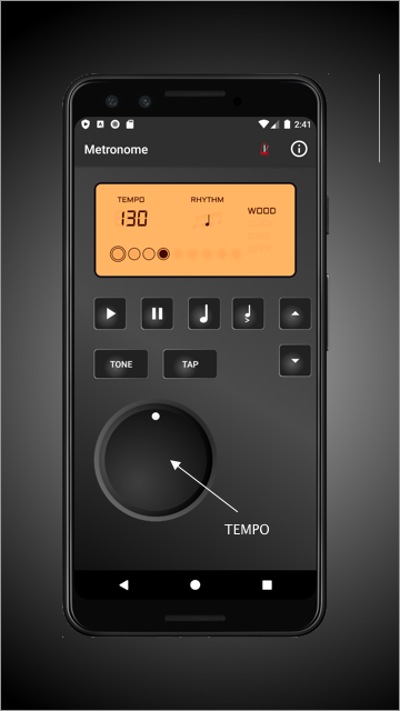
However, as the project progressed, I wanted to make it resemble a physical digital unit, as used by many musicians in the real physical world.
Physical units do not have a “SeekBar View”, and I wanted to mimic the rotary knob an actual unit might have.
Rotary knobs are very useful UI controls. They are much like a slider or SeekBar, usable in many situations. Here are some of their advantages:
- They consume very little real estate in your app
- They can be used to control continuous or discrete ranges of values
- They are immediately recognizable by users from real world applications
- They are not standard Android controls and thus bestow a unique “custom” feel on your app
While a few open source knob libraries for Android exist, I didn’t find quite what I was looking for in any of them.
Many were overkill for my modest needs, with functionality such as setting background images or handling taps for two or more mode operations, etc.
Some did not have the customizability I wanted to fit my project and came with their own knob image.
Still others assumed a discrete range of values or positions. And many of them seemed much more complex than needed.
So I decided to design one myself — which turned into a fun little project in itself.
In this article I’ll discuss how I built it.
So let’s see how we can create a rotary knob.
Designing a knob
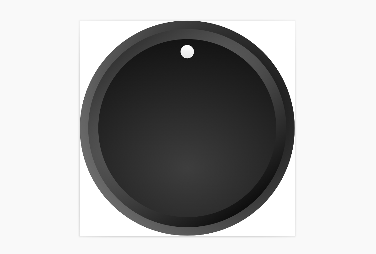
The first step was to create the graphic for the knob itself. I’m no designer by any means, but it occurred to me that the key to creating a sense of “depth” and movement in a knob control would be to use an off center radial gradient. This would allow me to create the illusion of a depressed surface and light reflection.
I used Sketch to draw the knob, then exported it to svg. Then I imported it back into Android studio as a drawable.
You can find the knob drawable in the GitHub project link at the bottom of this article.

Creating the view in xml
The first step in creating the View is creating a layout xml file in the res/layout folder.
The view can be completely created in code, but a good reusable View in Android should be created in xml.
Notice the <merge> tag — we'll use that since we’ll be extending an existing Android Layout class and this layout will be the inner structure of that layout.
We’ll use an ImageView for the knob, which we’ll rotate as the user moves it.
<?xml version="1.0" encoding="utf-8"?>
<merge xmlns:android="http://schemas.android.com/apk/res/android"
    android:layout_width="wrap_content"
    android:layout_height="wrap_content">

    <ImageView
        android:id="@+id/knobImageView"
        android:layout_width="wrap_content"
        android:layout_height="wrap_content"
        />
</merge>To make the knob configurable by xml, we'll create attributes for the range of values the knob will return, as well as for the drawable it will use for visuals.
We’ll create an attrs.xml file under res/values.
<?xml version="1.0" encoding="utf-8"?>
<resources>
    <declare-styleable name="RotaryKnobView">
        <attr name="minValue" format="integer" />
        <attr name="maxValue" format="integer" />
        <attr name="initialValue" format="integer" />
        <attr name="knobDrawable" format="reference" />
    </declare-styleable>
</resources>Next, create a new Kotlin class file, RotaryKnobView, that extends RelativeLayout and implements the interface GestureDetector.OnGestureListener.
We’ll use RelativeLayout as the parent container for the control, and implement OnGestureListener to handle the knob’s movement gestures.
@JvmOverloads is just a shortcut to overriding all three flavors of the View constructor.
Next we’ll initialize some default values and define class members.
class RotaryKnobView @JvmOverloads constructor(
    context: Context, attrs: AttributeSet? = null, defStyleAttr: Int = 0
) : RelativeLayout(context, attrs, defStyleAttr), GestureDetector.OnGestureListener {
    private val gestureDetector: GestureDetectorCompat
    private var maxValue = 99
    private var minValue = 0
    var listener: RotaryKnobListener? = null
    var value = 50
    private var knobDrawable: Drawable? = null
private var divider = 300f / (maxValue - minValue)A note about the divider variable — I wanted the knob to have start and end positions, rather than being able to rotate indefinitely, much like a volume knob on a stereo system. I set the start and end points at -150 and 150 degrees, respectively. So the effective motion for the knob is only 300 degrees.
We’ll use the divider to distribute the range of values we want our knob to return upon these available 300 degrees — so that we can calculate the actual value based on the knob’s position angle.
Next, we initialize the component:
- Inflate the layout.
- Read the attributes into variables.
- Update the divider (to support the passed in minimum and maximum values.
- Set the image.
    init {
        this.maxValue = maxValue + 1

        LayoutInflater.from(context)
            .inflate(R.layout.rotary_knob_view, this, true)

        context.theme.obtainStyledAttributes(
            attrs,
            R.styleable.RotaryKnobView,
            0,
            0
        ).apply {
            try {
                minValue = getInt(R.styleable.RotaryKnobView_minValue, 0)
                maxValue = getInt(R.styleable.RotaryKnobView_maxValue, 100) + 1
                divider = 300f / (maxValue - minValue)
                value = getInt(R.styleable.RotaryKnobView_initialValue, 50)
                knobDrawable = getDrawable(R.styleable.RotaryKnobView_knobDrawable)
                knobImageView.setImageDrawable(knobDrawable)
            } finally {
                recycle()
            }
        }
        gestureDetector = GestureDetectorCompat(context, this)
}The class will not compile just yet, as we need to implement OnGestureListener’s functions. Let's handle that now.
Detecting user gestures
The OnGestureListener interface requires that we implement six functions:
onScroll, onTouchEvent, onDown, onSingleTapUp, onFling, onLongPress, onShowPress.
Of these, we need to consume (return true) on onDown and onTouchEvent, and implement the movement login in onScroll.
    override fun onTouchEvent(event: MotionEvent): Boolean {
        return if (gestureDetector.onTouchEvent(event))
            true
        else
            super.onTouchEvent(event)
    }

    override fun onDown(event: MotionEvent): Boolean {
        return true
    }

    override fun onSingleTapUp(e: MotionEvent): Boolean {
        return false
    }

    override fun onFling(arg0: MotionEvent, arg1: MotionEvent, arg2: Float, arg3: Float)
            : Boolean {
        return false
    }

    override fun onLongPress(e: MotionEvent) {}

override fun onShowPress(e: MotionEvent) {}Here is the implementation of onScroll. We’ll fill in the missing parts in the following paragraph.
    override fun onScroll(e1: MotionEvent, e2: MotionEvent, distanceX: Float, distanceY: Float)
            : Boolean {

        val rotationDegrees = calculateAngle(e2.x, e2.y)
        // use only -150 to 150 range (knob min/max points
        if (rotationDegrees >= -150 && rotationDegrees <= 150) {
            setKnobPosition(rotationDegrees)

            // Calculate rotary value
            // The range is the 300 degrees between -150 and 150, so we'll add 150 to adjust the
            // range to 0 - 300
            val valueRangeDegrees = rotationDegrees + 150
                value = ((valueRangeDegrees / divider) + minValue).toInt()
                if (listener != null) listener!!.onRotate(value)
        }
        return true
}onScroll receives two coordinate sets, e1 and e2, representing the start and end movements of the scroll that triggered the event.
We’re only interested in the e2 — the new position of the knob — so we can animate it to position and calculate the value.
I am using a function we’ll review in the next section to calculate the angle of rotation.
As mentioned earlier, we’re only using 300 degrees from the knob's start point to its end point, so here we also calculate what value the knob’s position should represent using the divider.
Calculating the rotation angle
Now let’s write the calculateAngle function.
    private fun calculateAngle(x: Float, y: Float): Float {
        val px = (x / width.toFloat()) - 0.5
        val py = ( 1 - y / height.toFloat()) - 0.5
        var angle = -(Math.toDegrees(atan2(py, px)))
            .toFloat() + 90
        if (angle > 180) angle -= 360
        return angle
}This function calls for a bit of explanation and some 8th grade math.
The purpose of this function is to calculate the position of the knob in angles, based on the passed coordinates.
I opted to treat the 12 o’clock position of the knob as zero, and then increase its position to positive degrees when turning clockwise, and reducing to negative degrees when turning counterclockwise from 12 o’clock.
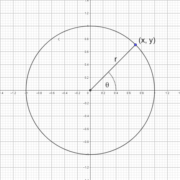
We get the x, y coordinates from the onScroll function, indicating the position within the view where the movement ended (for that event).
X and y represent a point on a cartesian coordinate system. We can convert that point representation to a polar coordinate system, representing the point by the angle above or below the x axis and the distance of the point from the pole.
Converting between the two coordinate systems can be done with the atan2 function. Luckily for us, the Kotlin math library provides us with an implementation of atan2, as do most Math libraries.
We do, however, need to account for a few differences between our knob model and the naïve math implementation.
- The (0,0) coordinates represent the top right corner of the view and not the middle. And while the x coordinate progresses in the right direction — growing as we move to the right — the y coordinate is backwards — 0 is the top of the view, while the value of our view’s height is the lowest pixel line in the view.
To accommodate that we divide x and y by the respective width and height of the view to get them on a normalized scale of 0–1.
Then we subtract 0.5 from both to move the 0,0 point to the middle.
And lastly, we subtract y’s value from 1 to reverse its direction. - The polar coordinate system is in reverse direction to what we need. The degrees value rises as we turn counter clockwise. So we add a minus sign to reverse the result of the atan2 function.
- We want the 0 degrees value to point north, otherwise passing 9 o’clock, the value will jump from 0 to 359.
So we add 90 to the result, taking care to reduce the value by 360 once the angle is larger than 180 (so we get a -180 < angle < 180 range rather than a 0 < x < 360 range)
The next step is to animate the rotation of the knob. We'll use Matrix to transform the coordinates of the ImageView.
We just need to pay attention to dividing the view’s height and width by 2 so the rotation axis is the middle of the knob.
    private fun setKnobPosition(angle: Float) {
        val matrix = Matrix()
        knobImageView.scaleType = ScaleType.MATRIX
        matrix.postRotate(angle, width.toFloat() / 2, height.toFloat() / 2)
        knobImageView.imageMatrix = matrix
}And last but not least, let’s expose an interface for the consuming Activity or Fragment to listen to rotation events:
    interface RotaryKnobListener {
        fun onRotate(value: Int)
}Using the knob
Now, let’s create a simple implementation to test our knob.
In the main activity, let's create a TextView and drag a view from the containers list. When presented with the view selection, select RotaryKnobView.
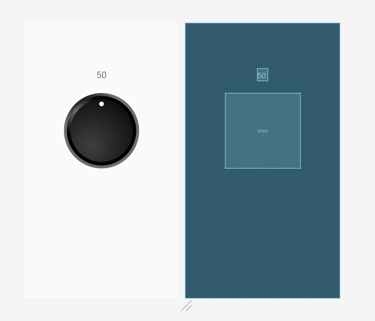
Edit the activity’s layout xml file, and set the minimum, maximum, and initial values as well as the drawable to use.
    <geva.oren.rotaryknobdemo.RotaryKnobView
        android:id="@+id/knob"
        class="geva.oren.rotaryknobdemo.RotaryKnobView"
        android:layout_width="@dimen/knob_width"
        android:layout_height="@dimen/knob_height"
        android:layout_marginBottom="312dp"
        app:layout_constraintBottom_toBottomOf="parent"
        app:layout_constraintEnd_toEndOf="parent"
        app:layout_constraintStart_toStartOf="parent"
        app:layout_constraintTop_toBottomOf="@+id/textView"
        app:knobDrawable="@drawable/ic_rotary_knob"
        app:initialValue="50"
        app:maxValue="100"
        app:minValue="0" />
Finally, in our MainActivity class, inflate the layout and implement the RotaryKnobListener interface to update the value of the TextField.
package geva.oren.rotaryknobdemo

import androidx.appcompat.app.AppCompatActivity
import android.os.Bundle
import kotlinx.android.synthetic.main.activity_main.*

class MainActivity : AppCompatActivity(), RotaryKnobView.RotaryKnobListener {

    override fun onCreate(savedInstanceState: Bundle?) {
        super.onCreate(savedInstanceState)
        setContentView(R.layout.activity_main)
        knob.listener = this
        textView.text = knob.value.toString()
    }

    override fun onRotate(value: Int) {
        textView.text = value.toString()
    }
}And we're done! This example project is available on github as well as the original metronome project.
The Android Metronome app is also available on Google’s play store.