By Emmanuel Ohans
Have you ever seen subtle text openings and wondered how they came about?
There’s so many of those out there, and it’s practically impossible to explain how they all work.
However, let’s pick an example and let me show you how to recreate it.
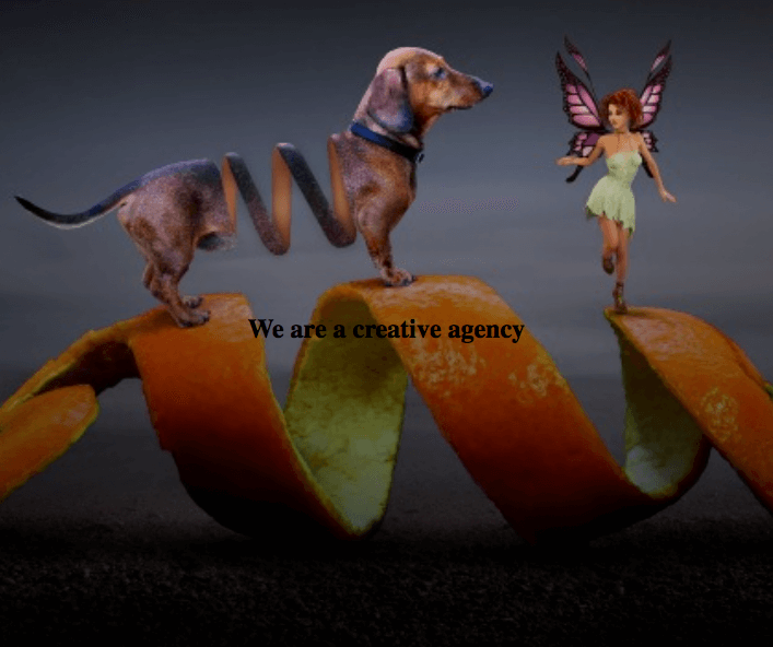
I made the choice already, and here’s what we will build:
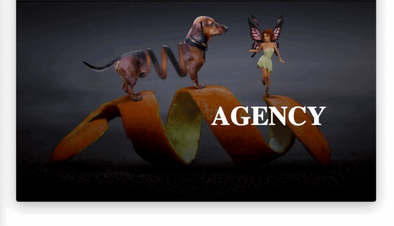
It’s a text opening for a fictitious creative agency. You can view the results here.
You see the flash, right? You also see how the animation is staggered — instead of animating the entire text at once, each word in the text is timed differently?
I’ll show you how to recreate these.
Put a smile on. You’ll love it!
Introduction
No one likes ugly markup. In fact, we won’t be writing much markup. Let’s just recreate this animation.
Firstly, grab your hoodie (if you have one) and put on your dev hat (you’ve got to have one of those).
Now, let me walk you through the step by step process. It’s not difficult, to be honest.
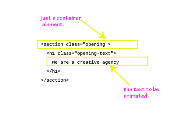
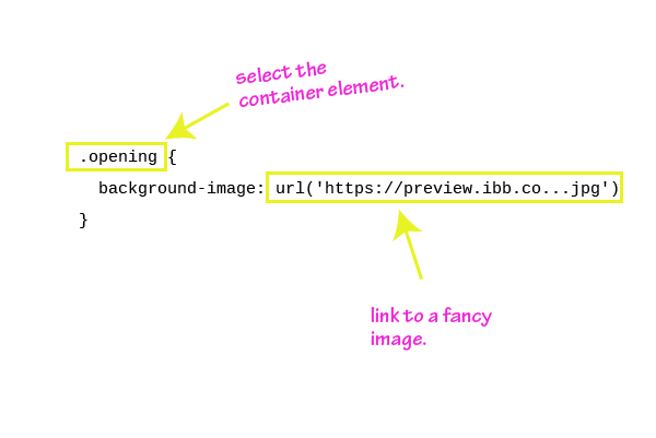
1. Introduce the Simple Markup Required.
<section class="opening"> <h1 class="opening-text"> We are a creative agency </h1></section>
2. Put in a decent background image.
.opening { background-image: url('https://preview.ibb.co/cBVBf7/fantasy_3146946_1280.jpg') }
Below is the result of that:
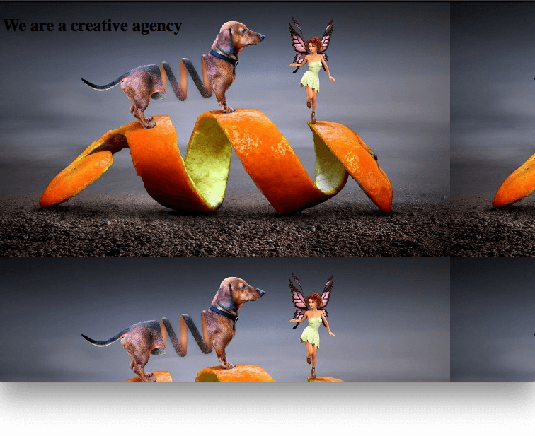
The result looks awkward, as the background image is repeated.
3. Stop the Repetition and Make the Background Image Prettier.
.opening { height: 100vh; background: linear-gradient(rgba(0,0,0,0.1), rgba(0,0,0,0.9)), url('https://preview.ibb.co/hkXMDS/fantasy_3146946_1920.jpg') no-repeat 50% 0%/cover; }
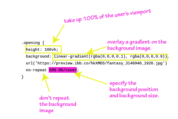
If you don’t understand the code above, it hinges on the premise that multiple backgrounds can be added to an element via CSS. These backgrounds should be separated by a comma. In the example above, the linear-gradient represents one background, and the url(..) the other. One adds a linear gradient, the other, an image.
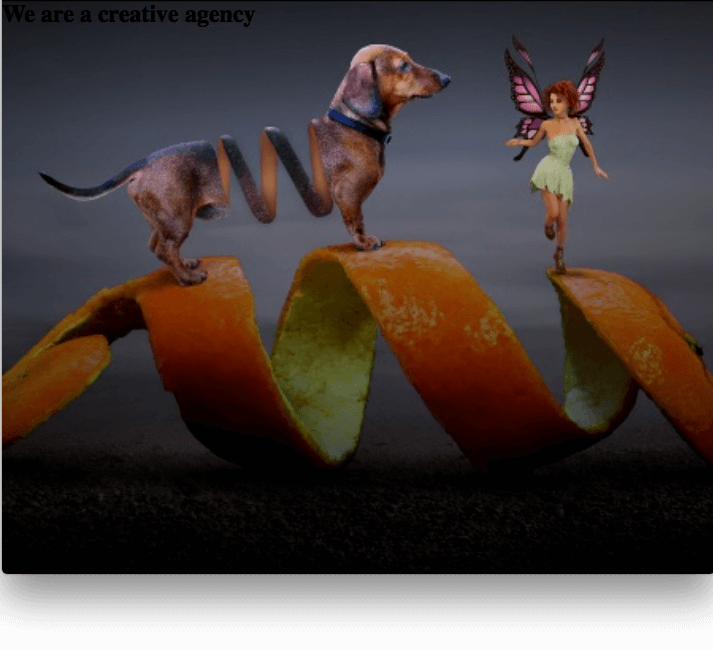
Take a look at the illustration above. It should make more sense now.
Still confused? Ask me any questions in the comment section as we go along.
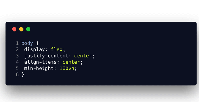
4. Position the Text Content in the Center.
Use Flexbox!
.opening { ... display: flex; justify-content: center; align-items: center;}
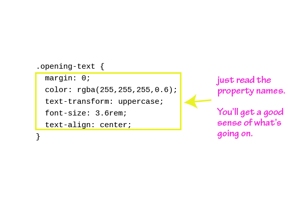
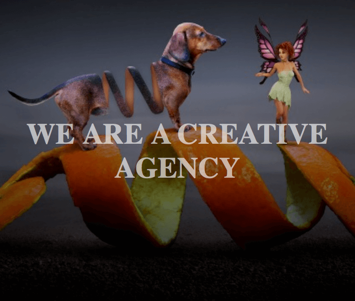
5. Just Before we Animate, Make the Text Pretty.
.opening-text { margin: 0; color: rgba(255,255,255,0.6); text-transform: uppercase; font-size: 3.6rem; text-align: center;}
6. Prepare to Animate!
If you take a look at the final result, you’ll notice that each word in the sentence is animated into the scene. We need a way to separate the words into individual elements.
Let’s handle this with JavaScript.
In a nutshell, here’s a graphical representation of what we want to do.
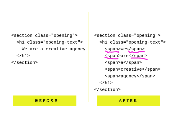
Now you understand the task at hand.
And here’s the code for that. I hope you’re comfortable with some JavaScript as I’m going to throw some at you.
const textNode = document.querySelector('.opening-text');const splitTextArr = textNode.innerText.split(" ");
let finalMarkup = "";splitTextArr.forEach(buildMarkup);function buildMarkup(text, index) { let spanText;
(index === 2) ? spanText = "<span>" + text + "</span><br />" : spanText = "<span>" + text + "</span> "; return finalMarkup += spanText;}/** Substitute the previous content for the new markup with span elements */textNode.innerHTML = finalMarkup;
It’s not too much to grasp, but I’ve gone ahead and illustrated what’s going on.
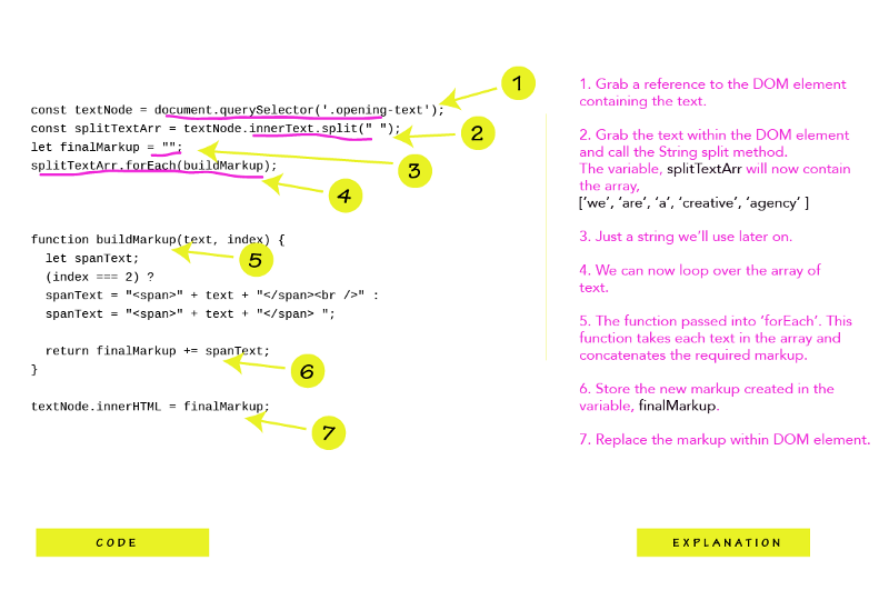
NB: Within the buildMarkup function, I’ve gone ahead and added a <br /> tag after the third word. This will make sure the text breaks up instead of staying on one line.
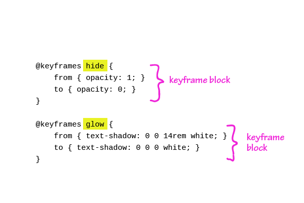
7. Write the Keyframes
@keyframes hide { from { opacity: 1; } to { opacity: 0; }}@keyframes glow { from { text-shadow: 0 0 14rem white; } to { text-shadow: 0 0 0 white; }}
There are two different animations we need for the final effect. One, the hide animation, and the other, the glow animation.
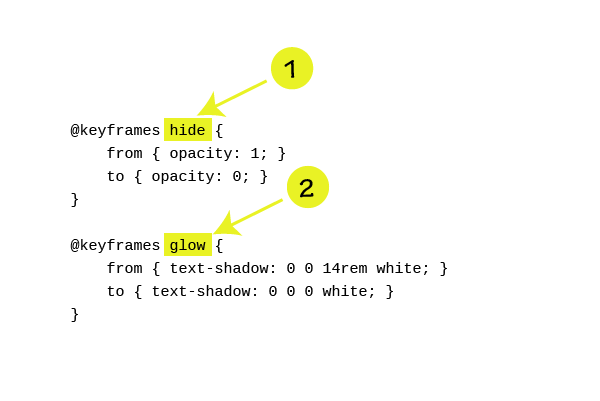
If you’re not conversant with how CSS animations work, getting my Advanced CSS Course is a no-brainer. In a nutshell, animations are largely powered by keyframes.
Within a keyframe block, you define the change in properties of an element over time.
See the code above. Even if you don’t know CSS animations well, I’m sure you can make a bit of sense out of it.
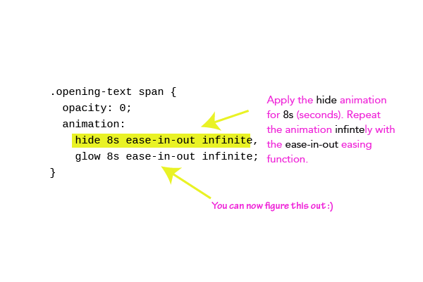
8. Apply the Animations to the Elements
.opening-text span { opacity: 0; animation: hide 8s ease-in-out infinite, glow 8s ease-in-out infinite;}
Looking good?
Here’s a bit of explanation.
The CSS text-shadow property is used to create the flash effect on the text. If you don’t know how text-shadowworks, have a look at the codrops reference. Even though I’ve been writing CSS for years, I looked it up for a refresher, too.
We are in this together!
9. Finally, offset the animations for a subtle staggering effect.
.opening-text span:nth-child(6n) { animation-delay: 900ms; }.opening-text span:nth-child(6n-1) { animation-delay: 700ms; }.opening-text span:nth-child(6n-3) { animation-delay: 600ms; }.opening-text span:nth-child(6n-4) { animation-delay: 300ms; }.opening-text span:nth-child(6n-5) { animation-delay: 0s; }
After wrapping each word in a span element, .opening-text now contains six elements. Each is targeted using the nth-child selector. Substitute n = 1 in the selectors above. You’ll get the hang of it.

I got lazy, but I’m sure if you spend some more time tweaking the values, you’ll have a prettier animation.
Yeah, we did it ?
Got stuck somewhere?
Let me know in the comments, and I’ll be happy to help.
Ready to become Pro?
I have created a free CSS guide to get your CSS skills blazing, immediately. Get the free ebook.