
By Jonathan Speek
Forms are an essential component of the web, as they connect users to your business and help them accomplish what they came to your site or app for. That being said, you want to make sure all of your users are able to use your forms without having a horrible experience. The goal is to make these key user interactions as frictionless as possible.
Although building forms can be a difficult task at times, making them moderately accessible isn’t as complicated as you might think. There are often excuses thrown around like, “we don’t have time to worry about accessibility” or “we’ll make it accessible later”. These excuses are often (if not always) invalid and you can help your team change this mindset.
Here are some things to consider when building forms:
- What difficulties might someone with visual impairments have using my form?
- Does the user have a clear indication of what data is expected for input?
- Is the form easy to understand quickly?
- Am I able to use the keyboard to complete the form?
Let’s make a basic subscription form
Start with this: starter code on CodePen
We’ll eventually get to this: finished CodePen
I’ve provided you with some basic styling and elements that would make up a simple subscription form, but there is a lot we can do here to make this form more usable. With anything you make, using good semantic HTML will get you a long way.
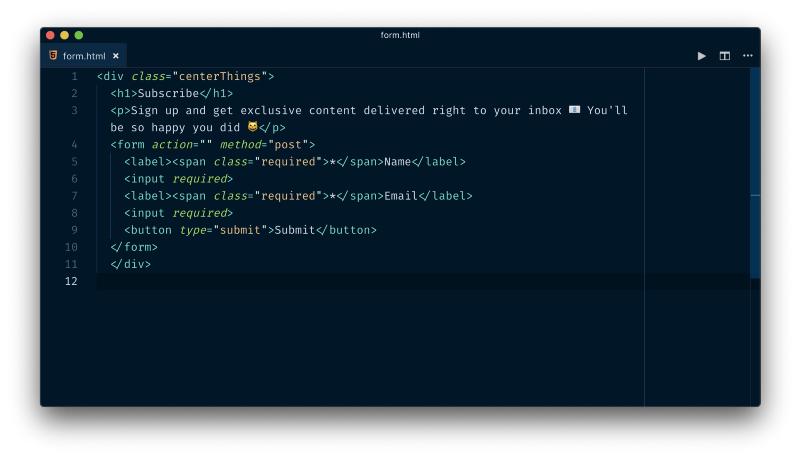
Let’s start by connecting the <input> elements to their respective <label>’s. We do this by giving the <input> an id and using that as the ’s for attribute. We can use “name” and “email” for these and we’ve already done two things:
- we’ve programmatically associated the label to the input, which will read the label to a screen reader user if that input is focused
- the user can now click on the label and the respective input will be focused, so users now have a larger target size
Now that our inputs and labels are all wired-up, we can define the HTML input types. These are really useful and a super easy way to give an excellent user experience. Adding the type attribute (read about the different types here) will help the user auto-fill your form and will provide a more suitable keyboard for mobile users. For our use case we can do type="text" for the name input and type="email" for the email input.
We also want our users to have a good idea of what type of data (and its formatting) we expect from them. Here it is pretty obvious, but that isn’t always the case. It’s generally good practice to provide a label that is always viewable and a placeholder that communicates the expected input. This means not using the placeholder attribute as a visual label for inputs where the label is not viewable once a users begins typing. This has been a popular practice and needs to be put to bed… We can give a placeholder of “ex. Jane Doe” for the name and “ex. jane.doe@example.com” for the email.
Now to wrap-up, we can work on the focus state styling. The default styling of focus states are different between the browsers and we can improve whatever the default styling might be to make more user friendly. In our case, we want the inputs to have a thick, colored outline that matches the button:
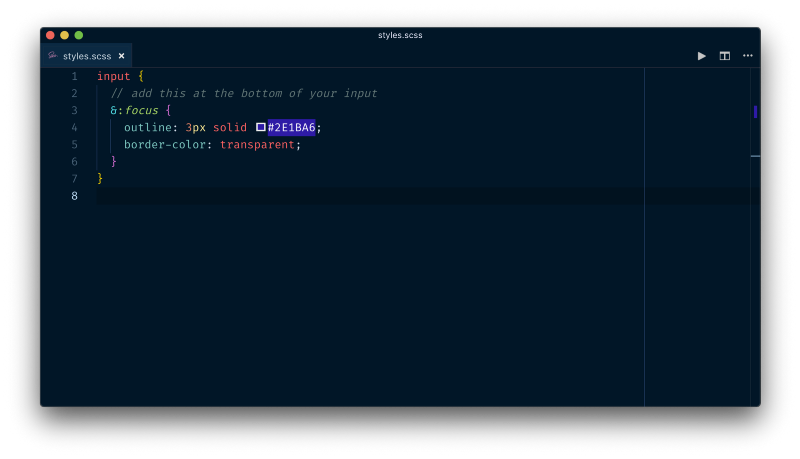
Lastly, we need to add some focus styles around button element. This is often overlooked, but can really help keyboard-only users know where they are. We need to add this &::moz-focus-innner bit to get rid of some default styling in Firefox (you might want to save that snippet for future use).
Just like that, we have a basic subscription form you can be proud of and improve on. Because we’ve used good semantics, the form is accessible via keyboard only (try using the tab and spacebar/enter keys). The colors used for the button are a color ratio of 11.51, meeting the AAA standards for WCAG (Web Content Accessibility Guidelines). We’ve provided labels for both visual users and screen reader users, as well as styled focus states for our keyboard-using friends. Finally, notice that the font is set to 18px in the body, this makes our form much more readable ? (you should try to stay above 14px).
Designing and building with accessibility in-mind takes practice, but you’ll be a better developer for it and you’ll have the added benefit of making the web a better place ?
Resources
Here are some great resources to help you empathize with your users and check your work:
Funkify — a brand new extension for Chrome that helps you experience the web and interfaces through the eyes of extreme users with different abilities and disabilities.
Sim Daltonism — visualize colors as they are perceived with various types of color blindness.
Web.dev — provide any URL, and web.dev will run a series of audits using Lighthouse.
MDN’s Accessibility Guide — this is a great resource to keep coming back to (I ❤️ MDN’s guides).
Color Contrast Checker — provides a quick and easy way to check color contrast ratios and what standards they meet.
Thanks for reading. If you have some knowledge to drop on accessibility, be sure to leave a comment.
You can follow me on Twitter here ✌️